Clothing styles
Strategies for mixing bright accent colors into neutral wardrobes while keeping overall outfits cohesive and wearable.
This evergreen guide explores practical, timeless methods for adding bold color pops to neutral wardrobes, ensuring balance, versatility, and everyday wearability through thoughtful palettes, textures, and styling tricks.
August 11, 2025 - 3 min Read
Neutral wardrobes provide a reliable canvas for color experimentation, yet integrating bright accents without overwhelming the eye can feel daunting. Start by identifying two anchor neutrals you trust—think classic black, warm beige, cool gray, or ivory—so the rest of your palette has a stable foundation. Choose one vivid shade to act as your primary accent, and plan how it will appear across tops, accessories, or footwear. The goal is repetition with restraint: a few well-placed color moments that unify your looks rather than scatter attention. Consider warming up a cool neutral with a zesty citrus or rosy pink, or grounding a warm base with electric blue. Balance keeps the outfit wearable across occasions.
A practical approach to color coordination involves aligning intensity, temperature, and proportion. Begin with intensity by selecting a bright hue that complements your skin tone and existing wardrobe basics. Next, ensure temperature harmony: cool neutrals pair well with cobalt or emerald, while warm neutrals glow beside tangerine or fuchsia. Finally, manage proportion by giving the accent color a meaningful but not dominant role—think a single statement piece or a curated pairing of two smaller items. By keeping the accent as a deliberate highlight rather than a sweeping color block, you preserve versatility and maintain a timeless feel that adapts to seasons and trends.
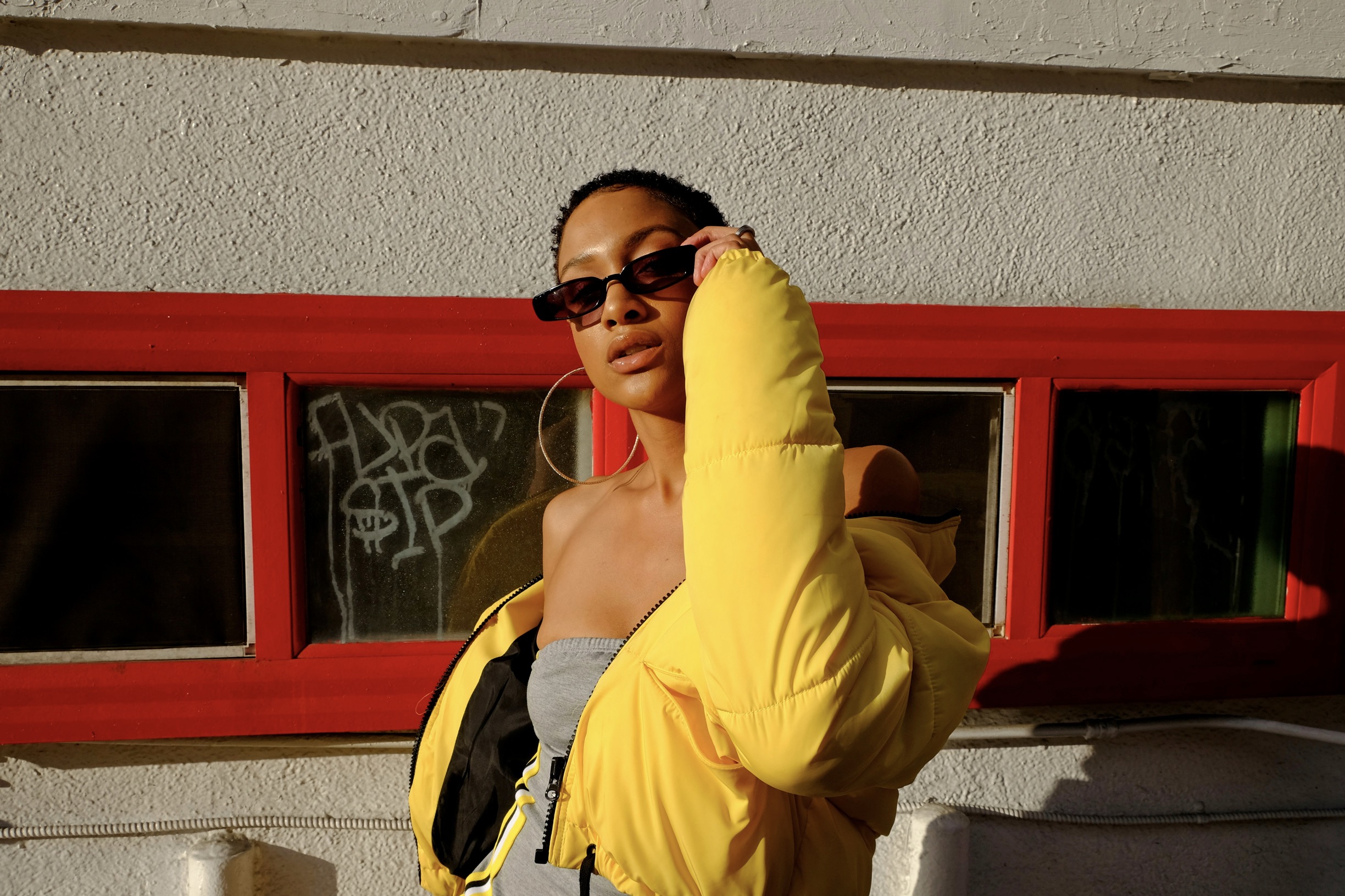
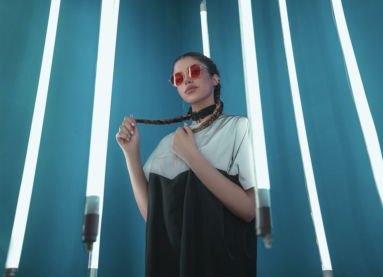
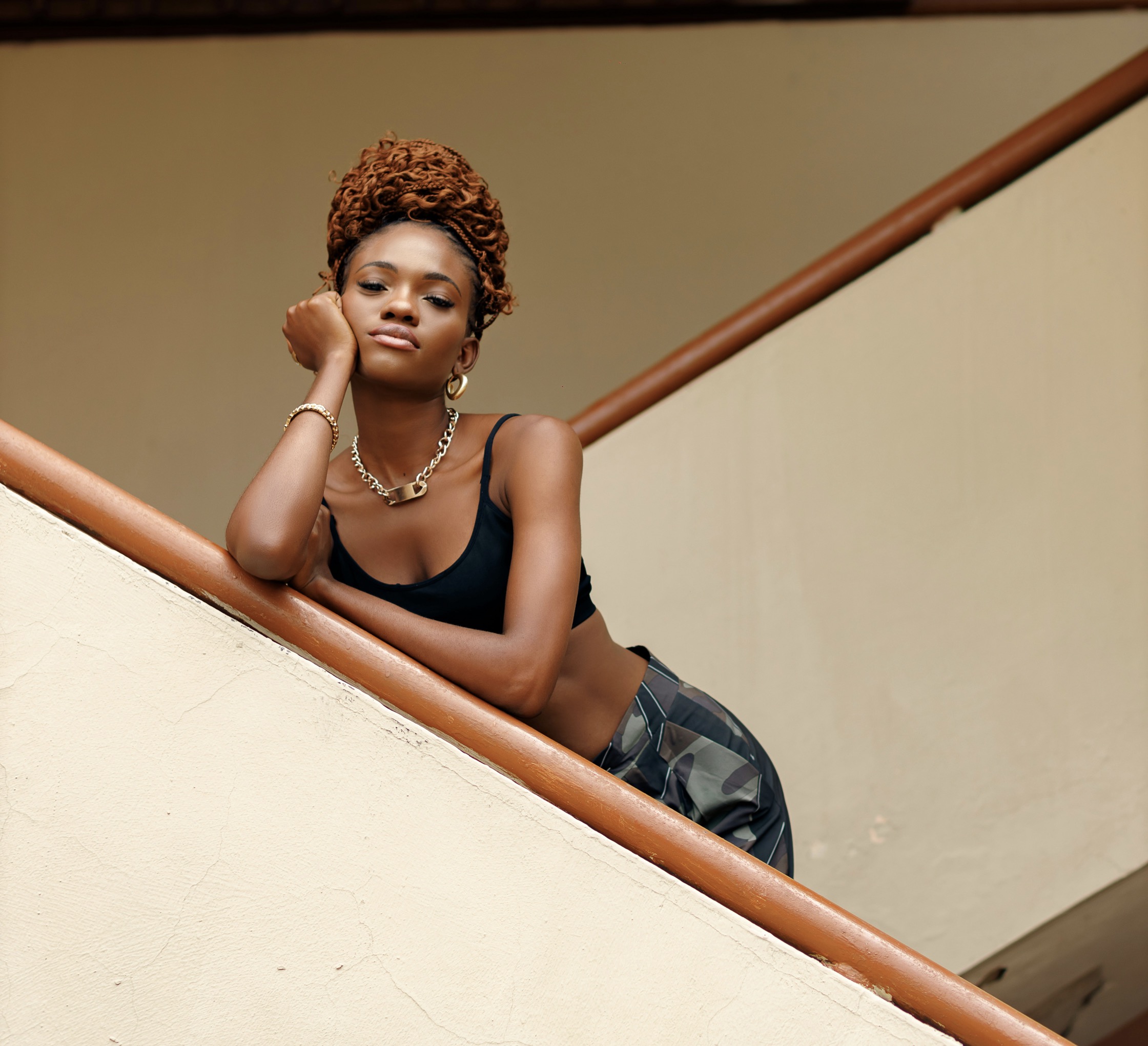
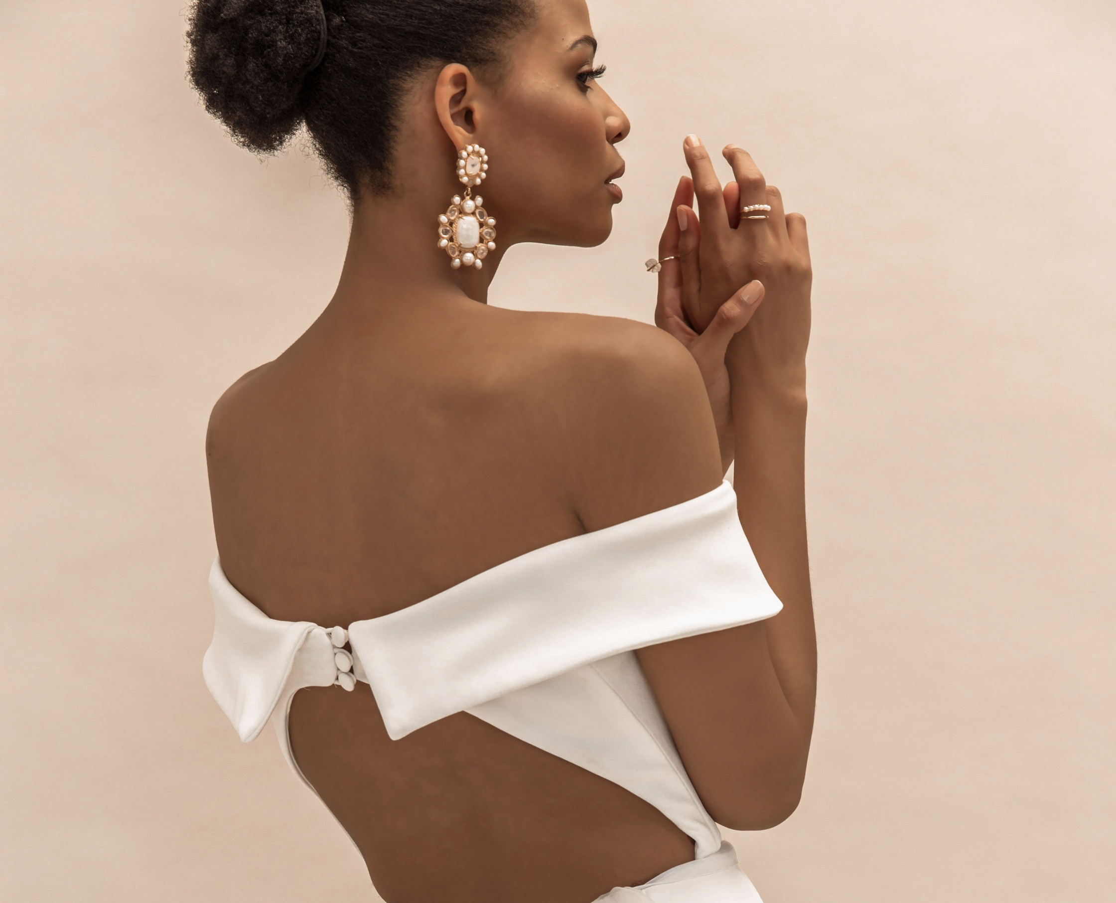
Accessories can anchor color while maintaining balance and versatility.
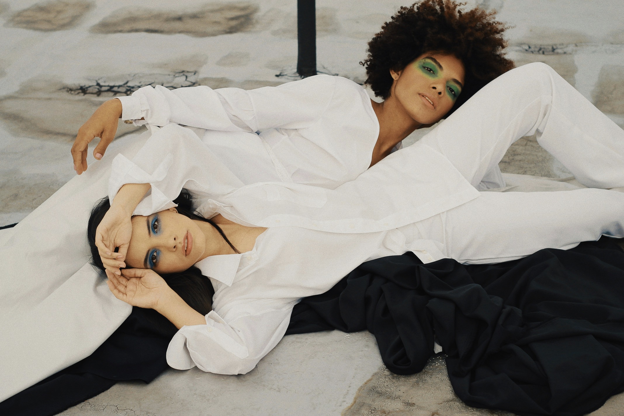
The texture you choose for your accent can dramatically alter its impact. A glossy satin blouse in a vivid hue will read differently from a matte knit or a structured leather bag. If you lean toward bold tones, mix textures to soften the brightness and add depth. Pair a saturated silk scarf with a neutral sweater to create a subtle color echo, or opt for a color-blocked jacket that uses varied fabrics to reduce visual weight. Texture becomes the connective tissue that ties disparate pieces together, allowing bright color to feel intentional rather than shouty.
Accessorizing with color is a reliable way to introduce brightness without redesigning your entire wardrobe. Start with one bright accessory, like a bag, belt, or pair of statement earrings, and keep the rest of the outfit in muted tones. This strategy creates a focal point that anchors your look while remaining adaptable for work, weekend, or evening events. If you want a stronger impact, repeat the accent in a smaller quantity elsewhere—for instance, a bright scarf that mirrors the hue of your shoes—so the color appears cohesive rather than accidental.
Use balance, repetition, and rhythm to weave color through your silhouette.
Layering is another effective method to integrate color thoughtfully. Incorporate a vivid cardigan, blazer, or outer layer over neutral basics, then reveal glimpses of color through sleeves or cuffs. This technique lets you control how much brightness enters the ensemble, making it easy to adjust for changing weather, office dress codes, or social occasions. When layering, ensure that each layer shares at least one common element with neutrals—whether a shared shade, a similar undertone, or a unifying texture. The result is a polished stack of pieces that looks intentional and cohesive rather than piecemeal.
Color-blocking can work beautifully if done with clear boundaries and predictable rhythm. Choose two near-adjacent brights or complementary hues and assign them to distinct sections of the outfit—top and bottom, or jacket and pants. Avoid mixing too many colors in a single silhouette, which can create visual noise. Instead, let one color dominate and the other serve as an accent that reinforces the overall theme. Finishing touches like neutral shoes or a belt help ground the look, ensuring the brighter tones remain vivid without overpowering the wearer.
Smart shopping choices sustain color concepts with lasting appeal.
A capsule approach can demystify bright accents. Build a small set of interchangeable pieces in a single accent color and pair them with a core neutral collection. For instance, a bright green cardigan, a cobalt blouse, and a magenta scarf can mix and match with black, white, or gray staples. By repeating the same color in different garments or accessories, you create visual continuity that reads as intentional design. This method reduces decision fatigue and makes it easier to update your looks with new neutrals while keeping the accent consistent and wearable.
Practical shopping mindset matters as much as technique. When selecting bright pieces, prioritize quality fabrics, colorfast dyes, and ethical production. Check that the shade remains balanced in various lighting—indoor, daylight, and evening lamplight—to avoid a color that shifts inunpleasant ways. Consider the versatility of each item: will it pair with multiple neutrals? Can it be dressed up or down? If a hue feels too intense for daily wear, choose a slightly softened version or introduce it through a small accessory rather than a full garment. Thoughtful purchases pay off in long-term wearability and confidence.
Seasonal flexibility keeps color strategies fresh and durable.
The way you wear color also depends on grooming and presentation. A bright piece benefits from a clean, polished base—well-fitted clothing, neat shoes, and minimal, cohesive makeup. Subtlety in hair and makeup allows the color to stand out without competing with it. Consider a simple monochrome lipstick or a neutral eye to keep the focus on your accent hue. When your overall look is balanced and well maintained, even a vivid garment emerges as a deliberate part of your style story. This discipline helps you feel comfortable wearing more daring tones in everyday life.
Finally, embrace adaptability through seasonal adjustments. In spring and summer, lighter fabrics like cotton blends or silk-mixings offer airiness that can carry bright shades with ease, while fall and winter textures—tweed, wool, or suede—lend a muted depth that makes color feel grounded. Rotate your accent color across seasons to prevent fatigue, but preserve a consistent tonal foundation so the wardrobe remains cohesive. A versatile color strategy ensures you can enjoy luminous hues year-round without sacrificing practicality or elegance.
A well-curated color philosophy can evolve with you. Start by documenting a few go-to combos that reliably look good on your frame and in your lighting conditions. Jot down which neutrals pair best with your chosen accents and note any textures that amplify or soften the effect. Over time, you’ll recognize patterns—the hues that flatter you most, the fabrics that wear best, and the occasions where brightness feels appropriate. This reflective practice turns a transient trend into a lasting habit, empowering you to experiment confidently while preserving the essence of your style.
To sum up, integrating bright accents into neutral wardrobes is less about chasing novelty and more about crafting harmonized, wearable color stories. Begin with a stable neutral base, introduce a single, well-chosen accent, and use repetition and texture to knit pieces together. Employ balanced proportions, thoughtful layering, and mindful accessorizing to maintain cohesion across outfits. With deliberate choice, you’ll build a versatile closet that welcomes bold color without overwhelming your silhouette or daily routine. In time, bright accents become a natural extension of your personal style—vibrant, polished, and authentically you.