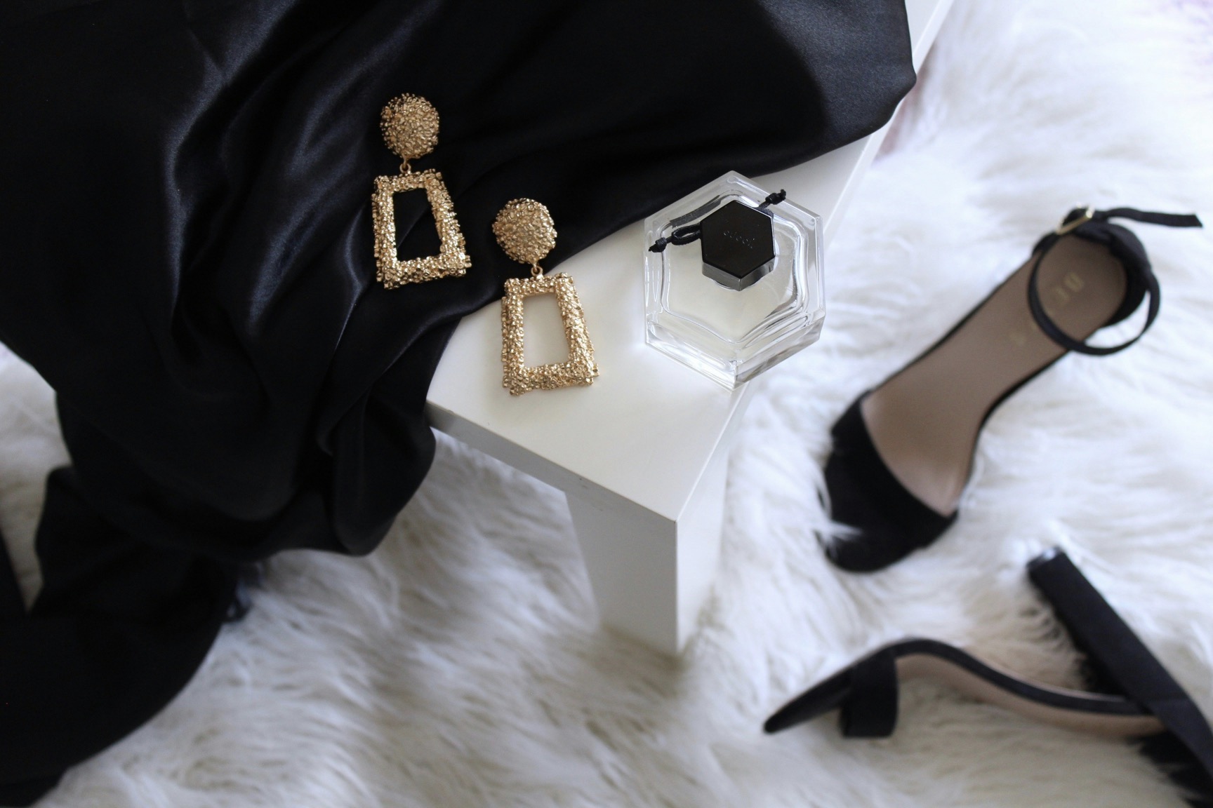
Footwear & accessories
Step-by-step advice for choosing jewelry to wear with patterned clothing to avoid competing focal points or clutter.
A practical guide to pairing accessories with bold patterns, outlining a deliberate approach to balance, contrast, and proportion so outfits feel cohesive, polished, and visually calm rather than chaotic or noisy.
Published by
Jerry Jenkins
July 31, 2025 - 3 min Read
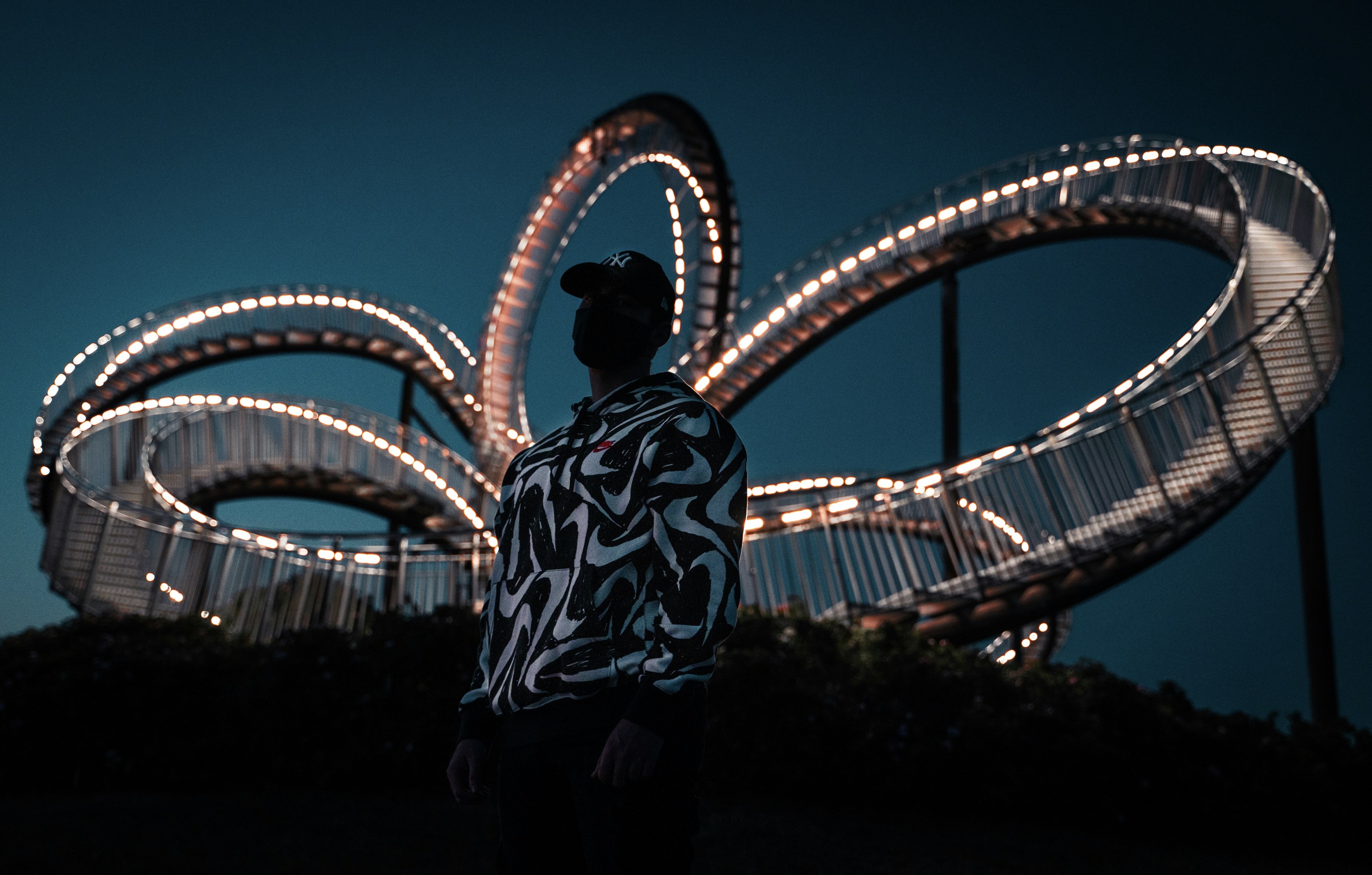
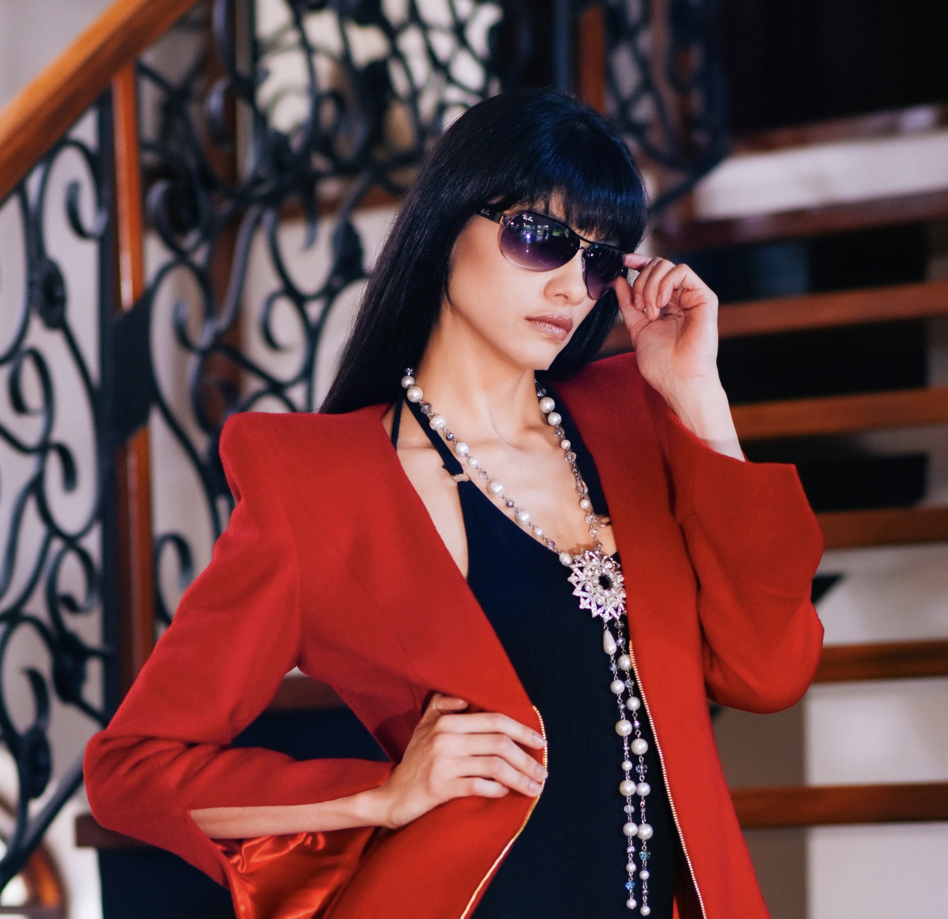
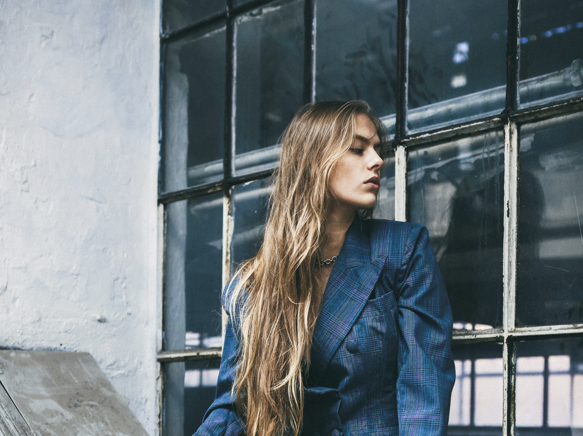
Patterned fabrics speak loud enough on their own, demanding thoughtful jewelry choices that won’t multiply distractions. Begin by identifying the pattern’s dominant color, scale, and mood. Large florals, geometrics, or animal prints each call for different restraint levels. When a pattern lifts strong eye interest, pick jewelry that lies in the same color family but remains subdued in shine and size. This creates harmony rather than competition. Consider the neckline as a silent partner, ensuring the jewelry sits beneath or above without crowding. The goal is a unified silhouette where every element complements rather than fights for attention.
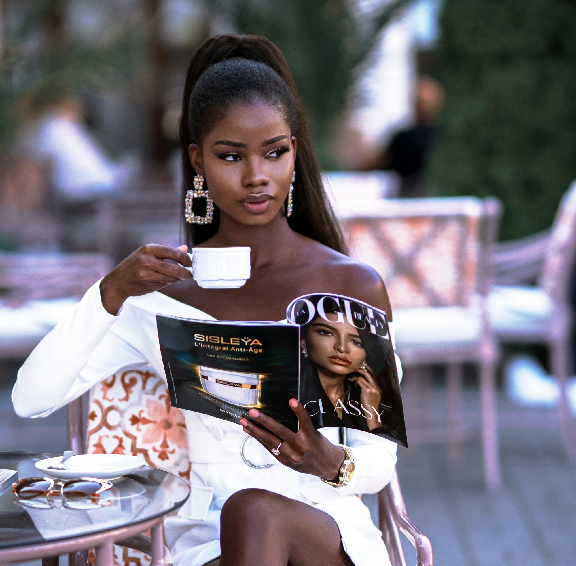
After establishing the pattern’s personality, translate it into jewelry tactics. If the print uses bold, saturated hues, choose minimal metal and simple shapes to avoid doubling the pattern’s intensity. If the pattern is monochromatic or subtle, you gain room to introduce a small, characterful piece that echoes a color from the print. The trick is proportion: earrings should feel lightweight next to a statement top, while a delicate bracelet can echo a line or a curve in the fabric. A well-chosen necklace can bridge color blocks without stealing focus from the main fabric story.
Let color resonance and finish guide your pairing choices.
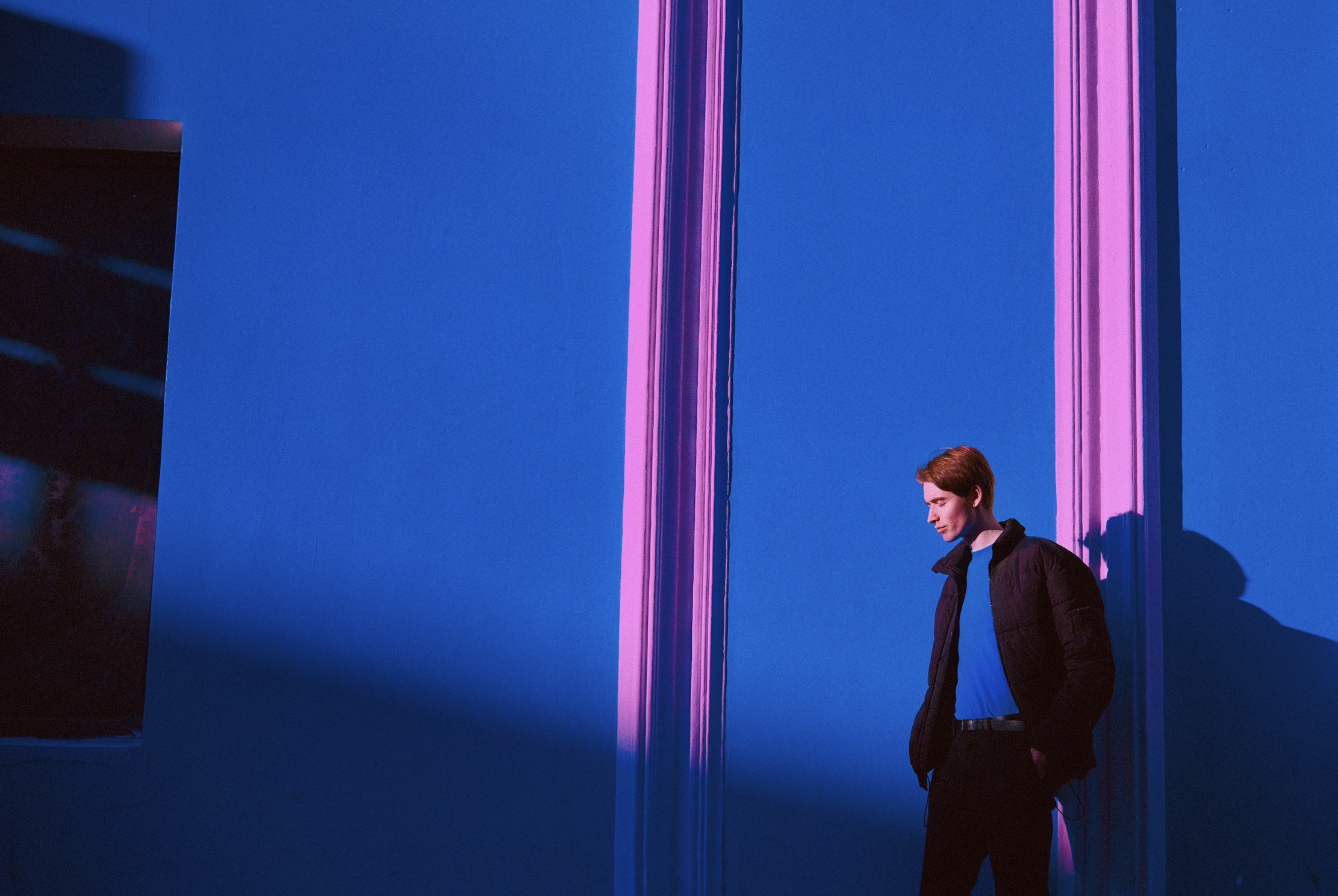
The first rule is scale. Matching the jewelry’s size to the pattern’s rhythm prevents visual overload. A busy, large-scale print often benefits from understated jewelry, such as tiny studs or a fine bracelet, which can offer a quiet counterpoint without competing for space. Conversely, a small, intricate pattern can handle a slightly more noticeable piece, provided the metal or gemstone remains smooth and non-reflective. When in doubt, err on the side of restraint and let the clothing lead. The wearer’s complexion, hair, and overall contrast should guide whether you lean toward warm golds, cool silvers, or mixed metals that don’t overpower the textile narrative.
Material texture matters as much as color. Matte finishes reduce glare, letting the fabric speak clearly. Shiny surfaces reflect light and can draw attention away from the print’s details, which may be desirable only if the pattern is extremely neutral. Layering is another nuanced tool: a single chain with a pendant that picks up a color from the print can anchor the look, while stacked rings or multiple bangles risk muddling the outfit if the palette isn’t tightly coordinated. Finally, consider the occasion. Everyday wear benefits from pared-down pieces, while evening events tolerate a touch more personality so your jewelry complements, not competes with, the patterned garment.
Practice proportional restraint with thoughtful color and texture.
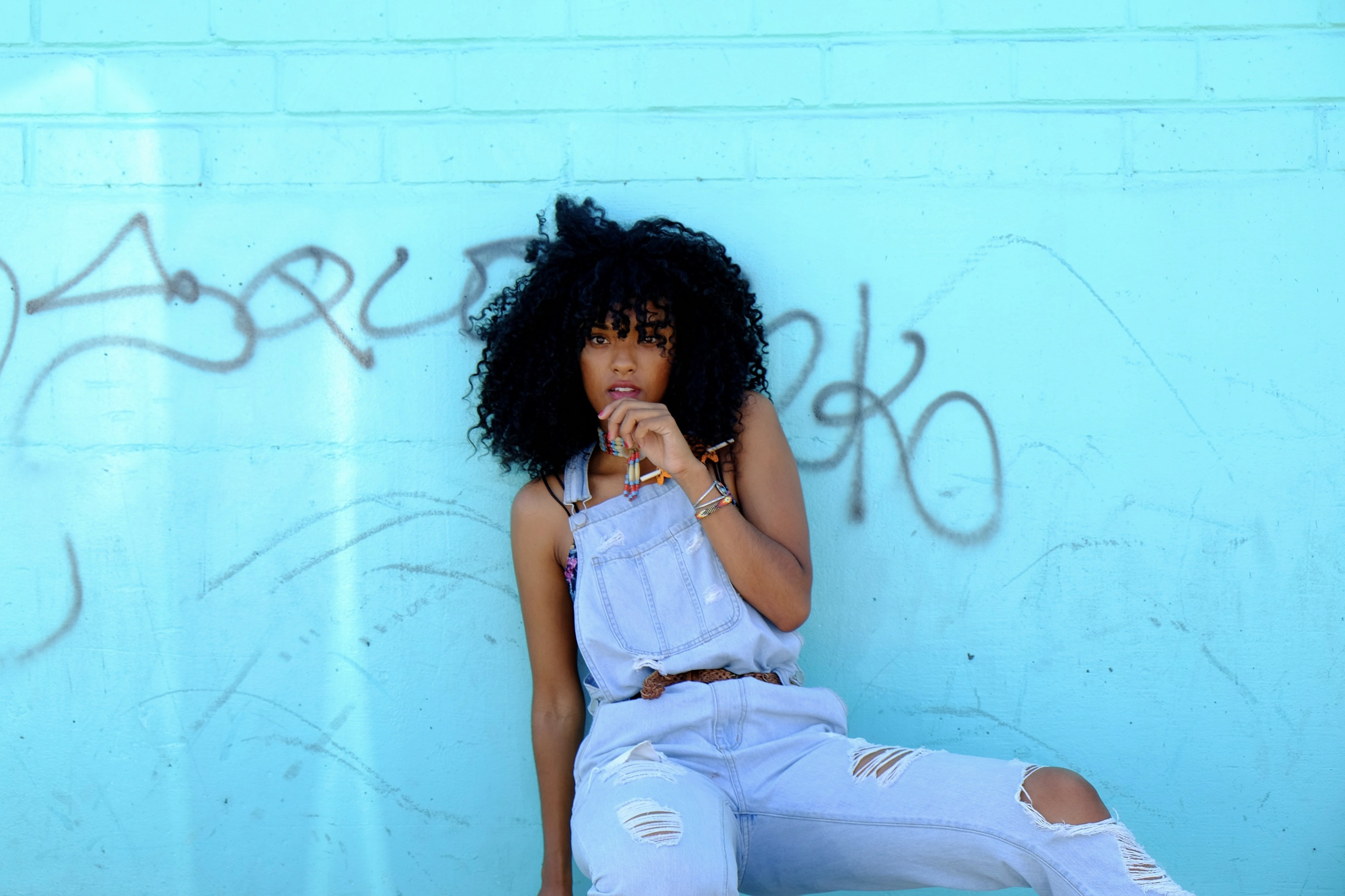
When a pattern contains one dominant hue, mirror that color in a small, non-reflective jewelry piece to create a cohesive look. For instance, a cobalt blue print can be paired with a muted blue stone or a blue-gray metal that picks up the hue without violent contrast. If the pattern features multiple colors, select a single coordinating shade for your jewelry and keep everything else neutral. This establishes a cohesive thread through the outfit. Finish is equally important: matte textures harmonize with busy fabrics, while satin or brushed metals can add depth without shouting. Avoid jewelry that introduces a new color family unless it’s used to highlight a repeating motif in the print.
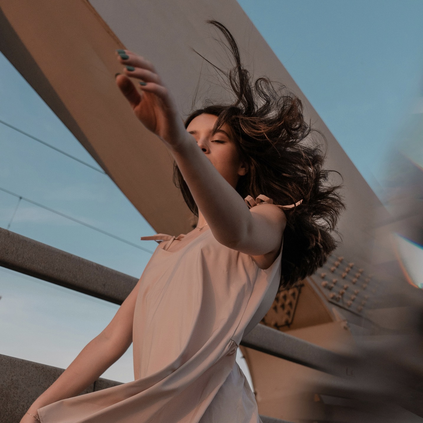
Another layer of strategy involves neckline awareness. A crew neck or boat neck often benefits from stud earrings and a slim bracelet, preserving a clean line that frames the face without crowding the print. V-necks and scoop necks invite pendant statements, as long as the pendant mirrors a color found in the garment. If the pattern is oversized, skip long necklaces that might wrap around the torso visually; instead, choose a concise chain or a drop earring silhouette that creates vertical rhythm. The objective is quiet balance so the eye travels naturally from fabric to accessories to face.
Build a micro-lexicon of color and contour for consistency.
The scale of the jewelry must reflect the fabric’s boldness. A loud pattern sometimes requires nearly invisible jewelry to prevent a clash. Minimalist options—tiny hoops, a fine chain, or a single bead—create negative space that allows the pattern to breathe. If the garment’s pattern is elegant but restrained, a slightly more noticeable accessory can enrich the ensemble without overpowering it. The color rule remains simple: pick one shade pulled from the print and repeat it sparingly. By threading a shared color through metal choice and stone, you achieve cohesion and subtle sophistication.
Texture choices can also help carve clarity from complexity. A textured surface on the jewelry, such as brushed metal or matte stone, reduces glare and mirrors the fabric’s depth, allowing both elements to coexist gracefully. Avoid reflective stones or highly polished metals that cast bright highlights on patterned fabric, unless the piece is intentionally used to punctuate a color in the print. Consider the wearer’s skin tone and hair color; jewelry that harmonizes with these hues reinforces the overall balance. The end result should feel intentional, not accidental, a curated dialogue between textile and ornament.
Translate these rules into calm, enduring wardrobe practices.
Create a mental map: which colors recur in your patterned wardrobe, which metals feel at home with the mood, and which shapes align with the garment’s silhouette. This framework makes shopping and wardrobe decisions efficient. Start by cataloging your most-worn patterned pieces and noting the dominant shade. Next, compile a small set of jewelry options that reliably complement that shade and the garment’s scale. Use this kit repeatedly to reduce guesswork and reinforce a signature style that remains versatile across different outfits. A disciplined approach also helps you notice when a piece becomes visually busy and should be swapped for something simpler.
Periodically reassess long-standing combinations. A pattern you wore with a certain necklace last season may feel dated or too busy this year. Rotate pieces to test new pairings, keeping the look fresh without sacrificing coherence. The best ensembles emerge from mindful experiments rather than massive overhauls. If you discover your jewelry is consistently competing with the print, step back and reintroduce negative space. Remember that fashion is about guiding attention’s flow: let the fabric speak first, then let the jewelry gently participate, and finally, allow the face to take center stage.
In practice, you’ll want a small capsule of jewelry that reliably complements patterned outfits. A pair of understated studs, a slim bracelet, and a modest pendant often cover most occasions. Keep a couple of accent pieces that pick up a single color from your favorite prints, but store them separately from louder, statement pieces to prevent accidental clashes. Regularly rotate items to preserve their visual impact and to keep your look from stagnating. The aim is consistency across your closet, not monotony; a stable core of jewelry allows pattern-driven outfits to feel deliberate, balanced, and unmistakably you.
Finally, trust your eye and test outcomes in real settings. Try different pairings in daylight and evening light to see how fabric and metal respond under varying illumination. Your environment affects perception, and what seems perfect in a showroom might feel crowded in a real-world setting. Gather feedback from trusted friends or stylists and note any recurring tensions between print intensity and jewelry shine. Over time you’ll develop an instinct: how to choose pieces that complete a look, how to avoid competing focal points, and how to celebrate patterned fashion with a refined, uncluttered finish.