Jewelry
How to Create A Balanced Jewelry Look When Wearing Busy Prints Or Bold Patterned Fabrics.
Navigating bold textiles requires strategic jewelry choices that harmonize color, scale, and texture while preserving personal style, ensuring the overall outfit remains striking without becoming overwhelming or visually noisy.
August 11, 2025 - 3 min Read
When you tackle busy prints or bold patterns, the jewelry you choose acts as a quiet negotiator between fabric and silhouette. Start by assessing the dominant colors within the print and pick metallic or gemstone tones that echo or subtly contrast those hues. If the pattern features multiple colors, lean toward a single focal piece in a coordinating shade rather than stacking several bright items. Consider the scale of the print: oversized patterns respond well to larger, singular jewelry statements, while micro-patterns benefit from delicate pieces that don’t compete for attention. The goal is cohesion, not competition, so let the fabric speak while your jewelry offers refined punctuation.
A practical approach is to use symmetry and proportion as your guiding principles. For a busy floral or geometric print, balance a pronounced neckline or sleeve with jewelry that mirrors the shape of the garment’s lines. Choose earrings that frame the face without extending beyond the jawline if the print draws focus downward. If you’re wearing a high-contrast or color-saturated fabric, pick metals with a muted glow—palladium, brushed gold, or gunmetal can soften the palette. Layering should be intentional: start with one standout piece and add a secondary piece only if it enhances, never overwhelms, the overall silhouette.
Balance color, scale, and shine with restraint and intention.
When selecting necklaces to pair with loud fabrics, prioritize a single, well-constructed piece over multiple strands. A pendant necklace or a chokers with clean lines can anchor the look without competing with the garment’s motif. If your print features a heavy dose of color, consider neutral metals or stones that pick up only one accent shade from the pattern. The necklace’s length matters: justo above the décolletage works well under a boat neck, while a longer chain can elongate the torso if the print is dense. Remember that negative space created by the chain height is as important as the item itself.
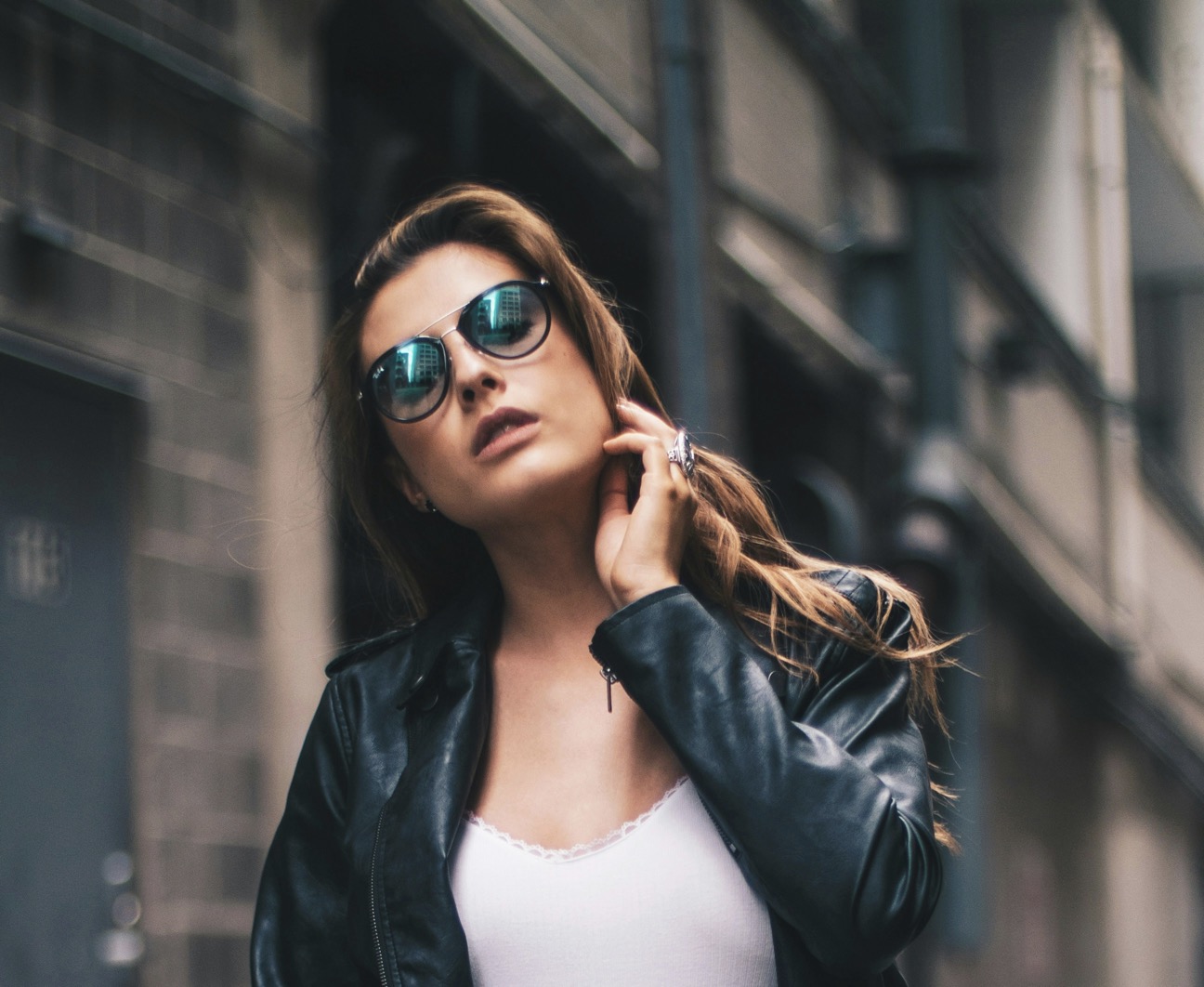
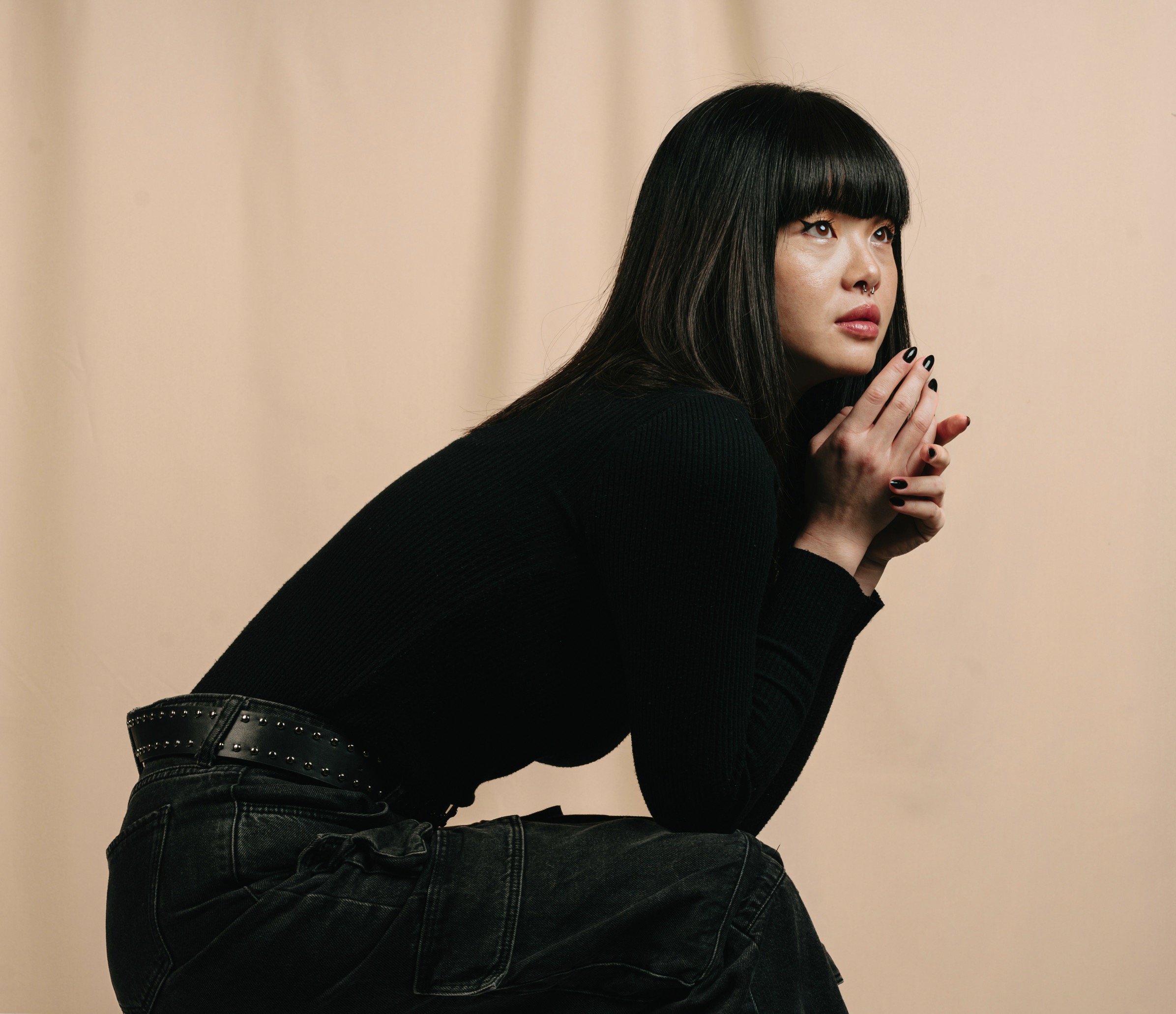
Earrings deserve equal attention in a busy print ensemble. Opt for earrings that follow the fabric’s energy: angular, geometric shapes pair nicely with structured prints, while softer, organic curves complement fluid patterns. If the print is extremely busy, go small and sleek to avoid a turbulent visual field around the face. For louder textiles, stud earrings in a single metal tone create a calm counterpoint, and drop earrings should stop just above the collarbone to prevent tugging attention downward. The aim is a gentle frame for your features, not a competing spectacle around your ears.
Use cohesive materials and shapes to frame the face.
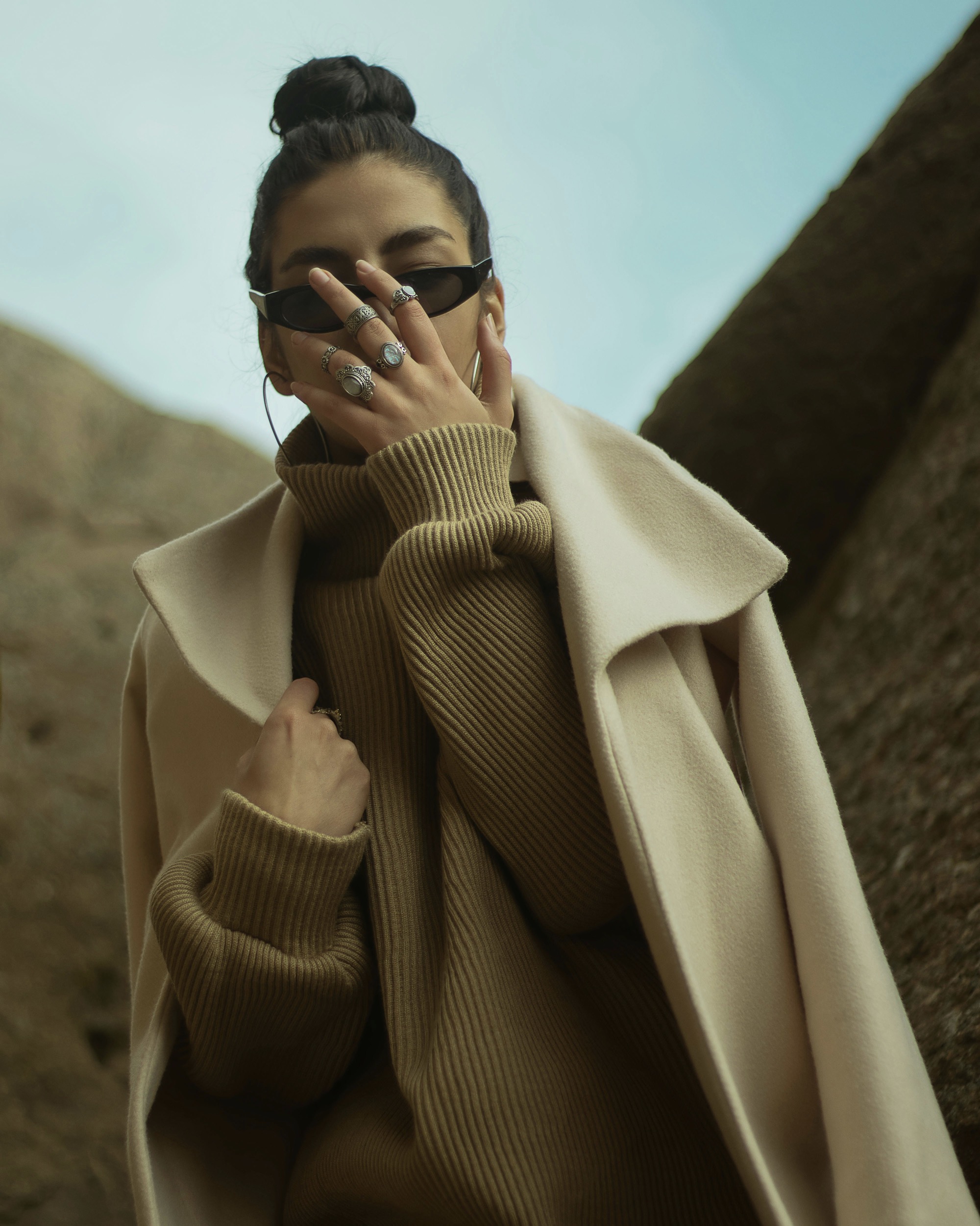
Color coordination begins with a deliberate pull from the print’s spectrum. If the pattern contains multiple hues, pick one as the anchor color for your jewelry and keep other accents minimal. A monochrome jewelry set can feel cohesive when paired with a multicolor print, as it bets on texture and shape rather than hue variety. Texture matters too: matte metals are excellent news for busy fabrics, reducing glare and creating a refined, understated glow. Subtle gemstone highlights, chosen to echo the pattern’s brightest note, will unify the look without stealing the show from the garment.
The decision to stack or solo hinges on the garment’s overall rhythm. If the print has dynamic movement like waves or chevrons, a single bold piece often suffices to provide anchor. For quieter fabrics, well-judged stacking can introduce personality while maintaining balance. When stacking, vary the lengths so the eye travels smoothly from neckline to chest, avoiding a crowded neckline. Regardless of method, ensure the fastening and backing are secure enough to withstand movement and the fabric’s texture, which can affect how jewelry sits and catches light throughout the day.
Keep the scale of jewelry in line with the print’s footprint.
The face remains the focal point, so curate jewelry that draws attention upward rather than outward. Choose a collar or neckline that pairs well with your pattern, then select pieces that ornament the area above it. A bold print near the shoulders can be complemented by a simplified earring and a single radiant ring. If the pattern includes metallic threads, reflect that shimmer with a matching metal tone—avoiding a clash between warm and cool hues. By prioritizing harmony over variety, you allow your features to illuminate alongside the fabric’s energy rather than fighting it.
Texture can transform a busy look into a considered statement. Mix a glossy finish with a matte base to create depth without overwhelming color. A hint of sparkle in one element—such as a faceted gemstone—can lift a heavy print while keeping the rest calm. When a pattern runs into the collar or neckline, pivot toward jewelry that stays close to the skin, such as delicate bracelets or a slim ring. The effect is a well-balanced composition where light plays across both the garment and the accessories in a controlled, elegant manner.
Build a ritual of testing lines and lighting.
Consider the print’s scale as a guide to jewelry proportions. Large, bold patterns typically pair better with oversized, singular pieces that act as anchors, while tiny, intricate prints suit finer, more numerous accessories. If you’re wearing a statement print on a rounded neckline, a pronounced pendant can echo the curve without competing with the pattern’s energy. For stripes or grids that create directional lines, mirror those lines with elongated earrings or a long, slender chain. Small details can become a strategic advantage when aligned with the garment’s geometry.
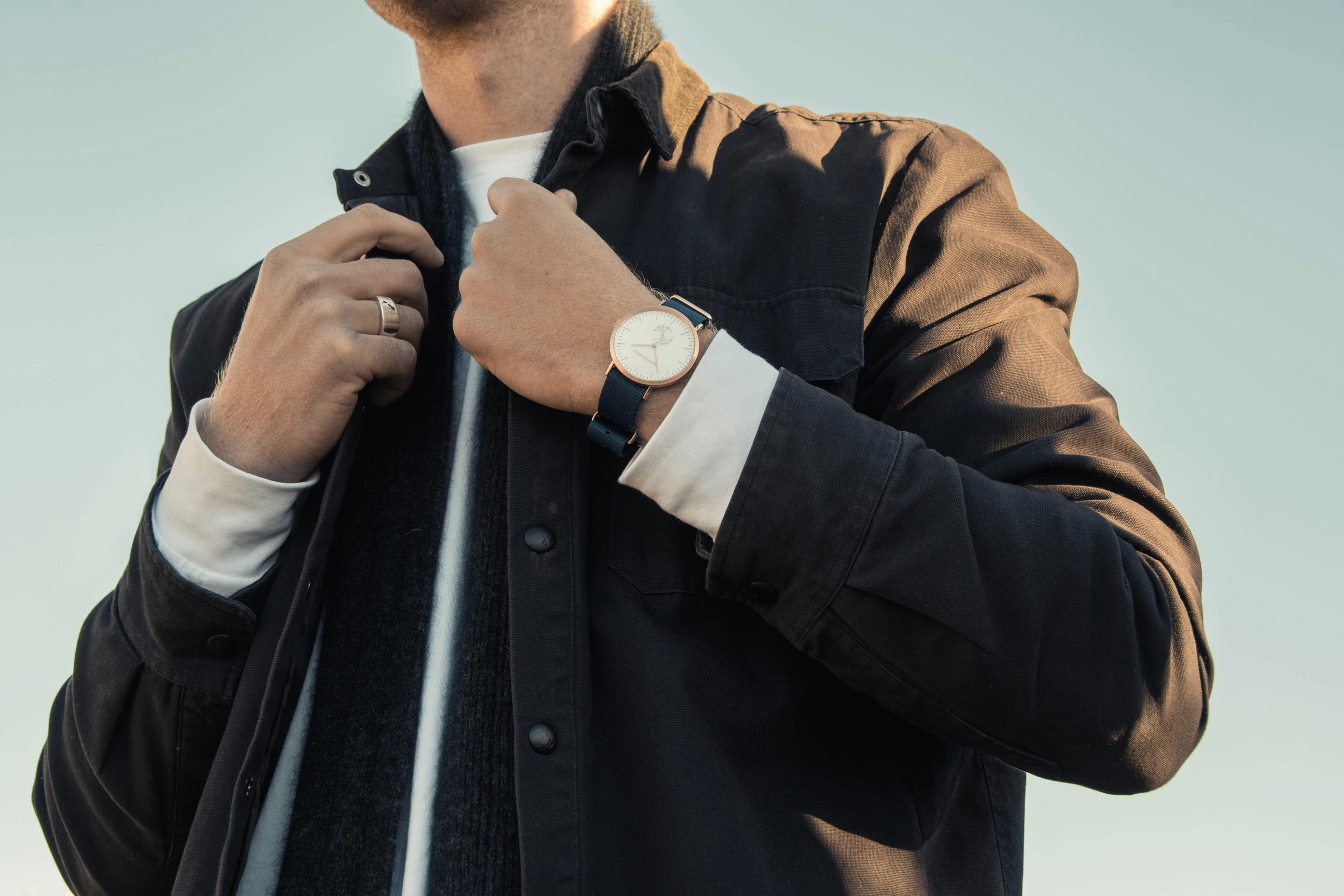
The fabric’s weight and fiber content influence how jewelry sits. Heavier textiles respond well to stronger metal presence—think chunky links or bold statement rings—whereas lighter fabrics deserve more delicate adornments to prevent bulk. If the fabric carries a sheen, pick a metal that either harmonizes with that shine or provides a subtle contrast to avoid a mirrored, garish effect. In all cases, try items on with your full outfit to observe how the pieces interact as you move, sit, and greet people, ensuring comfort travels with style.
A practical method for perfecting the balance is a trial run in natural light. Look at how the jewelry reads from different angles as you walk or tilt your head, noting which pieces disappear into the print and which stand out in the right places. If a piece competes with the fabric’s pattern even slightly, switch it for something quieter until harmony is achieved. Carry a small mirror to test quick changes during the day, ensuring that your chosen jewelry remains legible and elegant under varying light conditions and movement.
Finally, cultivate a personal rule of simplicity when in doubt. A signature, pared-down approach rarely goes wrong with busy fabrics. The right combination delivers a polished, thoughtful appearance that respects both the garment and the wearer. Build a capsule of versatile pieces you trust to work across patterns, allowing you to mix and match confidently. Remember that confidence often reads louder than any accessory, and the most balanced looks arise from selecting jewelry that elevates the whole outfit without shouting over its voice.