Men's style
How to choose the best wardrobe colors for men aiming to simplify dressing and build cohesive outfit combinations effortlessly.
A practical guide for men seeking color clarity, simpler daily styling, and versatile, cohesive outfits through thoughtful color selection, harmonizing tones, and strategic neutrals that elevate every wardrobe decision.
Published by
Jessica Lewis
July 28, 2025 - 3 min Read
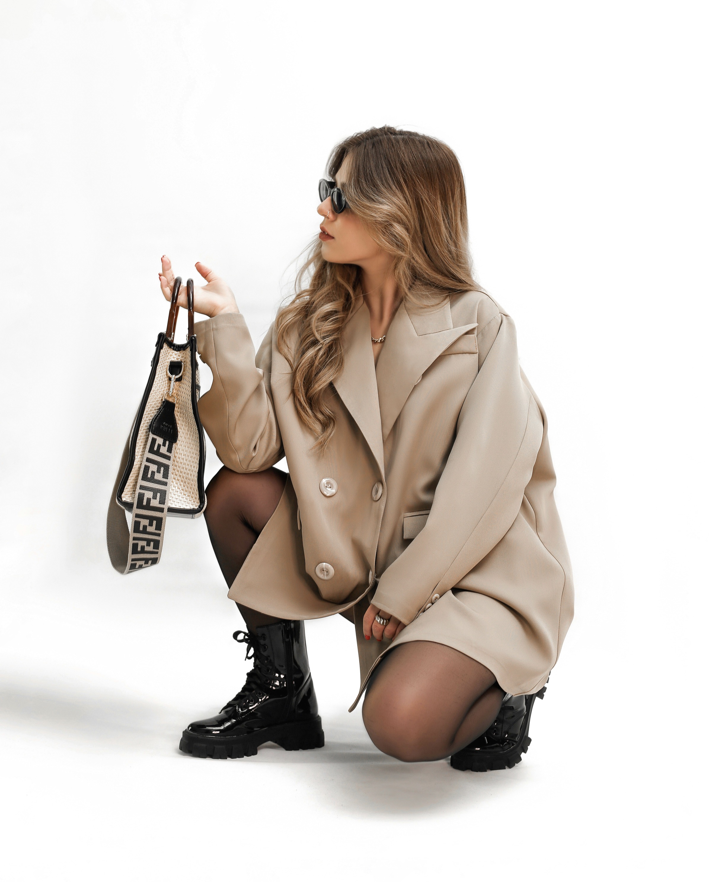
Color theory for men’s wardrobes starts with understanding what harmonizes with most complexions and fits easily into daily routines. The goal is to reduce decision fatigue, not to chase every trend. Begin by identifying a dominant palette of neutrals—think charcoal, navy, taupe, black, and ivory—that form the backbone of most outfits. Then add one or two accent colors you genuinely enjoy, ensuring they pair well with your neutrals without clashing. This approach yields a base you can trust in morning, while small pops of color keep things interesting. By prioritizing versatile tones, you create wardrobe cohesion that translates into confident, effortless dressing across weekdays and weekends alike.
When choosing wardrobe colors, consider your lifestyle and the environments you frequent. If you spend much of your time in professional settings, lean toward subdued, timeless neutrals with limited bright alternatives. For social or creative spaces, you can weave warmer or cooler hues into accessories and statements, knowing they won’t overwhelm your core style. The trick is balance: let your neutrals be the main stage and reserve brighter shades for shirts, knitwear, or outerwear that you can remove when necessary. This strategy minimizes overthinking, keeps outfits repeatable, and helps you feel composed regardless of the day’s demands.
Build a disciplined color system with repeatable accents and limited palettes.
A practical starting point is to build a color circle around three core neutrals that you wear most often. Choose navy, charcoal, and warm beige as anchors. These tones blend naturally with a wide range of blues, greens, and earthy neutrals, creating seamless transitions from top to bottom. As you assemble outfits, test how light and dark variations of these neutrals interact. For instance, a dark navy jacket paired with a light beige chinos combination instantly reads polished, while still allowing room for subtle texture. Experiment with muted shades in accessories to reinforce the overall harmony without overpowering the look.
Once your neutrals are secure, you can introduce a restrained color language through small, intentional accents. Start with one accent color that complements your dominant neutrals—perhaps a forest green, burgundy, or muted olive. Limit yourself to one or two items in that color per outfit to avoid visual noise. The key is repetition, not novelty: reuse the color across sweaters, shirts, or a scarf, so outfits feel deliberate rather than random. By maintaining this disciplined approach, you’ll build a wardrobe that reads as cohesive, intentional, and easy to coordinate on busy mornings.
Organize by color family and shade for faster, smarter outfits.
Color coordination becomes effortless when you adopt a simple rule: formal tones stay within neutrals, while casual pieces offer personality. For workwear, favor deep versions of your neutrals—rich navy, graphite gray, or espresso brown. Save brighter hues for weekend wear in items like a crewneck sweater or a casual jacket. This separation ensures you can mix and match with confidence, knowing each piece belongs to a defined category. Over time, you’ll notice fewer mismatched combinations and more outfits that look intentional, comfortable, and composed without requiring extensive planning.
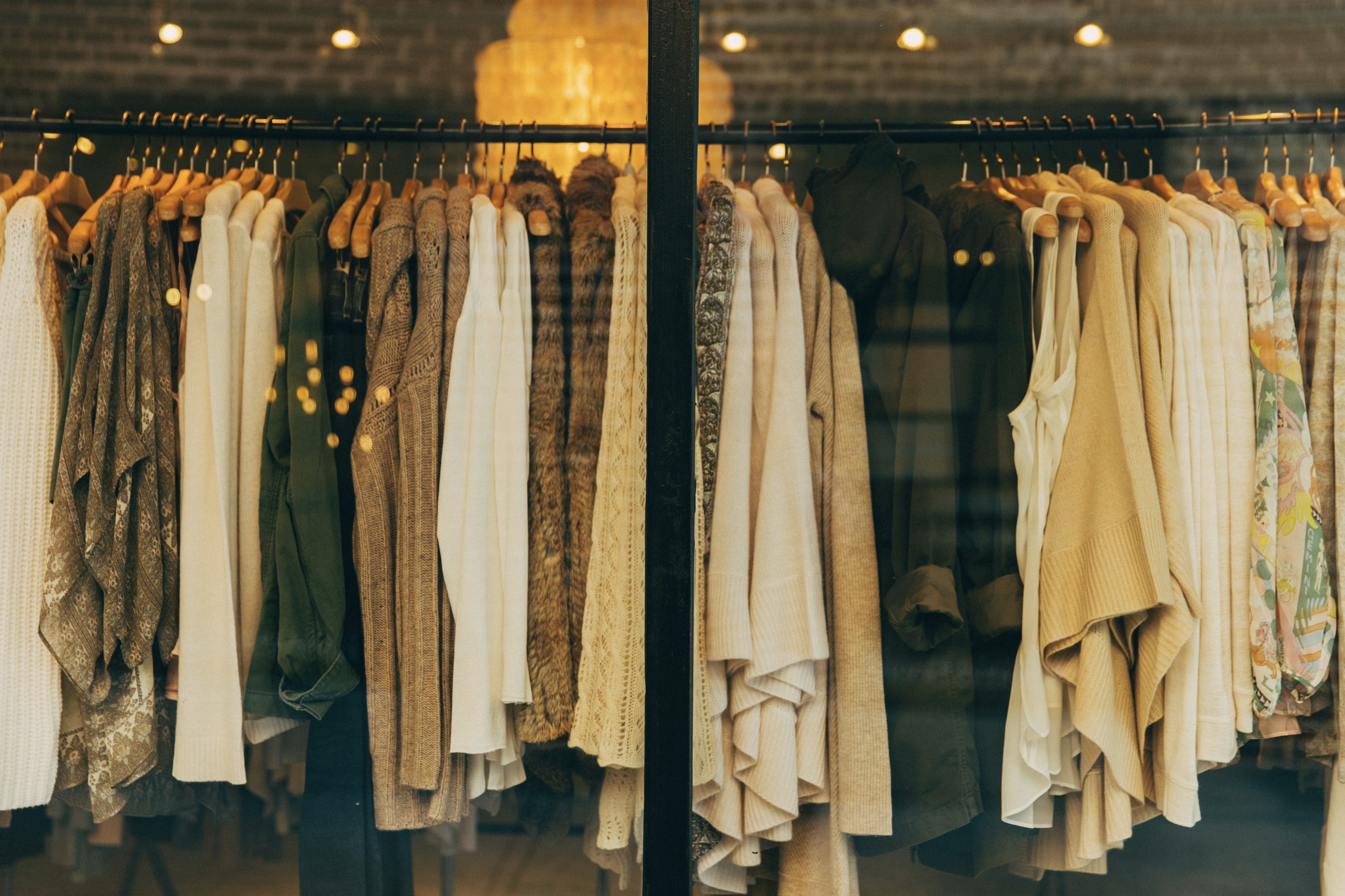
Another practical strategy is to organize your wardrobe around color families rather than individual pieces. Group items by hue families—blues, greens, earth tones—and then by shade intensity. This method helps you quickly assemble outfits because you can scan groups rather than search item-by-item. It also makes responsible shopping decisions easier: you can identify gaps in your color coverage and fill them with complementary items rather than duplicative ones. The result is a streamlined closet that supports consistent, cohesive dressing while reducing impulse purchases.
Consider fabric and color balance to preserve cohesive depth.
Beyond neutrals and controlled accents, consider the role of temperature in color selection. Cool-toned outfits—blues, greens, and icy grays—toster a crisp, modern vibe, while warm-toned ensembles—beiges, browns, and olive—evoke approachability and comfort. Your skin undertone can influence which palette flatters you most, so test nearby in natural light. If you find warm tones bring out your best features, lean into them gradually rather than replacing your entire capsule. A measured mix of cool base pieces with occasional warm accents can yield a versatile wardrobe that suits a range of occasions and lighting conditions.
Maintaining color integrity across fabrics is essential for a coherent look. Colors behave differently on wool, cotton, denim, or synthetics, so you should consider fabric weight and texture when mixing pieces. A navy wool blazer may appear more saturated than a navy cotton shirt, yet they can still pair well if you maintain a consistent intensity. Preplan outfits by fabric weight and color family, ensuring the overall visual depth remains balanced. When in doubt, favor tonal variations within the same color family to keep contrasts subtle and stylish.
A practical color map helps keep daily choices fast and confident.
Practical shopping guidance reinforces a simplified color strategy. Before buying, evaluate how a new item fits into your existing neutrals and whether it can anchor multiple outfits. A blazer in deep teal, for example, should be able to anchor both smart-casual and more formal looks when paired with different neutrals. Ask whether the piece can be worn with items you already own, and whether it complements upcoming seasonal shifts. This approach prevents color overload and builds a durable base layer of clothing that you can rotate across seasons with minimal effort.
To extend this system into daily routines, create a lightweight color map for yourself. Note which colors pair best with your most-worn pants and shirts, along with the occasions you frequent. A simple reference, kept in your closet or a note on your phone, can guide morning decisions. It’s not about rigid rules but rather a reliable framework that supports quick, confident choices. Over time, this map evolves as your wardrobe grows, yet its core function remains: a practical tool for consistent, cohesive dressing without wasting time.
A well-chosen color palette also communicates personality while preserving versatility. Neutral bases emphasize discipline and reliability, while selective color accents reveal taste and subtle flair. The best palettes avoid extremes, favoring balanced hues that work across different lighting and settings. As you refine your wardrobe, you’ll notice fewer occasions of what-should-I-wear hesitation, replaced by a quiet confidence that comes from knowing your clothes support your day rather than complicate it. The result is a wardrobe that feels integrated, mature, and distinctly yours.
Finally, remember that quality matters as much as color. The way a garment drapes, the finish of a fabric, and the fit influence how color reads on you. A well-cut navy blazer or a soft charcoal sweater will consistently look intentional, even when paired with varied neutrals. Invest in pieces with timeless silhouettes and durable materials so your color system remains relevant decade after decade. With the right combination of neutrals, restrained accents, and thoughtful fabric choices, you’ll curate a cohesive, easy-to-dress wardrobe that simplifies mornings and elevates everyday style.