Age-inclusive style
Tips for wardrobe color coordination that simplifies dressing and maximizes outfit cohesion daily
A practical guide to color coordination that transcends trends, helping you assemble cohesive outfits quickly, reducing decision fatigue, and expressing personal style with confidence every day.
August 09, 2025 - 3 min Read
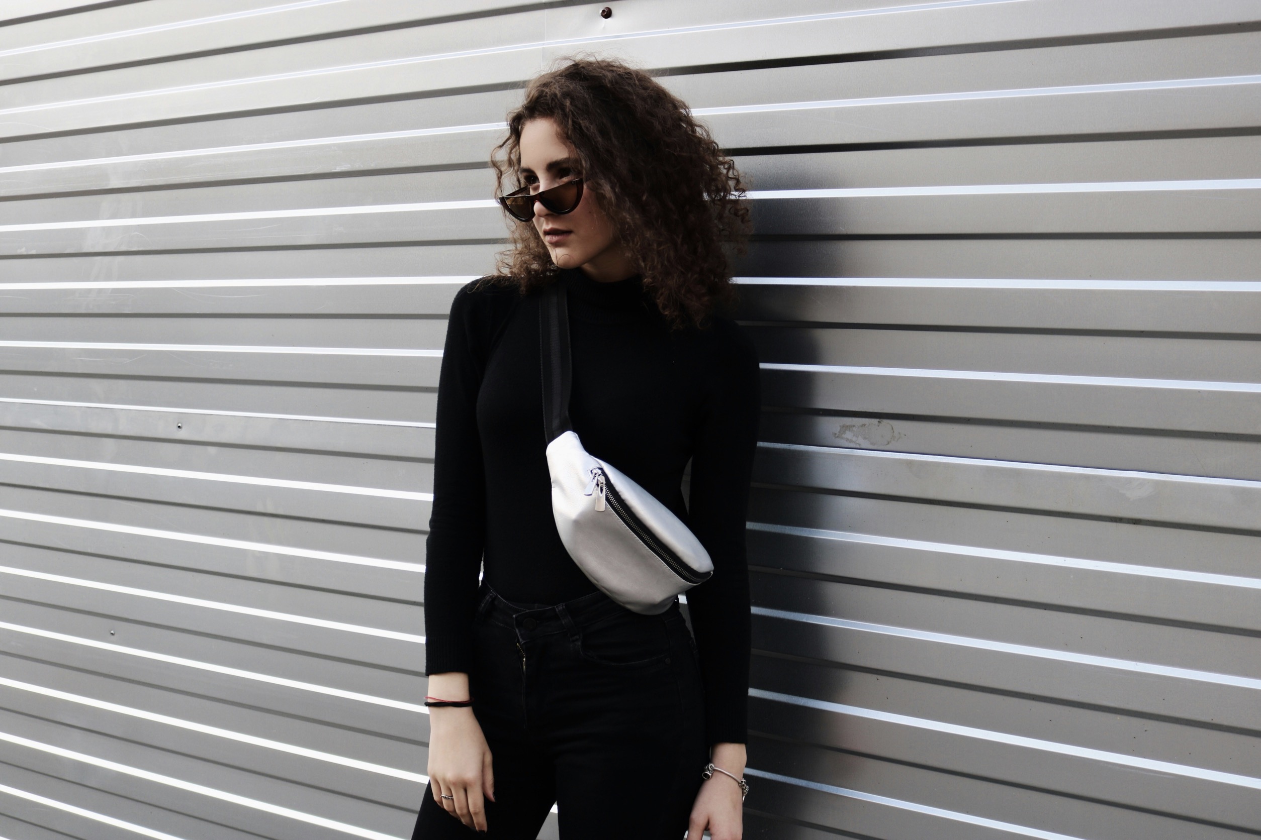
Color coordination begins with a few reliable anchors you can reuse daily. Start by choosing a dominant neutral base—black, navy, taupe, or white—that fits your skin tone and lifestyle. Build around that foundation with one or two accent colors you enjoy, ensuring they contrast gently with the base rather than clash. When in doubt, think of warmth versus coolness and select one hue that harmonizes with your complexion. This approach minimizes the number of options you must juggle while maintaining flexibility for different occasions. Over time, you’ll recognize which neutrals pack the most versatility, enabling you to mix garments without rethinking the entire outfit.
Another essential principle is a cohesive color family strategy. Group your wardrobe into warm-toned and cool-toned capsules, and keep items within each capsule interchangeable. This reduces misfits and simplifies shopping decisions, because you’ll know that a burgundy blouse will pair nicely with charcoal trousers or an olive skirt can sit beside a camel sweater. When you need a pop, reserve one standout accessory—like a scarf or belt—in a color that echoes a core shade from your base palette. The goal is to craft a flexible, repeatable system that stands up to last-minute plans without requiring a full reset.
Create a personal color map that travels with you
A well-structured color system doesn’t confine creativity; it empowers it. Start by documenting your core palette on a small card or note on your phone, listing two or three neutrals and two or three accent tones you love. When shopping, compare new pieces against this list to verify compatibility before purchasing. As you rotate garments, you’ll notice patterns: certain tops look great with several bottoms, while some hues naturally elevate your skin and hair. This awareness prevents dead purchases and fosters a sense of clarity. With practice, coordinating colors becomes almost automatic, freeing energy for styling details like textures and silhouettes.
Practical color coordination also involves understanding lighting. Natural light reveals true tones in fabrics, while indoor lighting can skew them toward yellow or blue. When you’re trying on outfits, check under different light sources—sunlight, incandescent lamps, and fluorescent lighting—to ensure your choices stay harmonious. If you frequently wear the same color near your face, consider how it interacts with your skin’s undertones. Cool undertones pair well with jewel tones and slate, whereas warm undertones thrive alongside earthy shades and creamy neutrals. Adapting to lighting conditions is an easy way to preserve cohesion throughout the day.
Build a minimalist framework that travels between seasons
A portable color map is a simple tool for on-the-go outfit decisions. Photograph or list your go-to color pairings by occasion: work, casual, evening, and travel. Include one or two backup combinations for unexpected weather or events. This map acts as a quick reference when you’re packing or choosing items from a shared closet. It also reduces decision fatigue, especially after long days when mental bandwidth is low. Your map evolves as preferences change, so revisit it quarterly to retire stale combos and introduce fresh pairings that align with your current style goals.
Beyond palettes, texture and shade depth influence perceived cohesion. A matte black top reads differently than a satin; a heather gray knit offers more softness than a plain black tee. Incorporate variations in shade within the same color family to create visual interest without breaking cohesion. For example, pair a dark navy blazer with medium blue jeans and a powder blue blouse for a layered, harmonious look. By prioritizing depth and texture, you prevent outfits from appearing flat while still preserving a consistent color language across all garments.
Dress for daily life with color confidence and ease
A minimalist approach to color means fewer, better pieces that mix and match across seasons. Invest in a handful of shades that reliably flatter your skin and eyes, even as fashion cycles shift. A capsule wardrobe built on these constants reduces clutter and makes dressing fast. When new pieces enter your closet, evaluate how well they align with your core shades before committing. Avoid excess color experiments that complicate coordination. Instead, select items that extend your palette in meaningful ways, such as a charcoal coat that complements both summer and winter wardrobes or a warm taupe ensemble that bridges spring and fall.
Seasonal transitions benefit from deliberate tonal shifts rather than complete color overhauls. Instead of buying a whole new color set, you can subtly adjust by leaning into lighter or richer tones of your established hues. For instance, move from deeper charcoal to a softer ash during spring, then return to the same family in a deeper shade for winter. This strategy keeps your outfits cohesive while honoring the natural tempo of the year. Additionally, consider adding small, color-consistent accents—belts, scarves, or jewelry—that can refresh looks without destabilizing your core color framework.
Practice makes color coordination second nature over time
Everyday dressing is easier when you recognize which colors energize you and which feel muted. If you naturally gravitate toward brighter tones, incorporate them as accents rather than base pieces; if you prefer subdued tones, keep most garments in a refined palette and use one vivid item to spark interest. Your choice should support your activities: business settings call for disciplined color pairings, while weekend wear allows playful contrasts. Regardless of occasion, aim for coherence by repeating at least one color element across different pieces. This simple rule keeps ensembles tied together and reduces the cognitive load of decision-making.
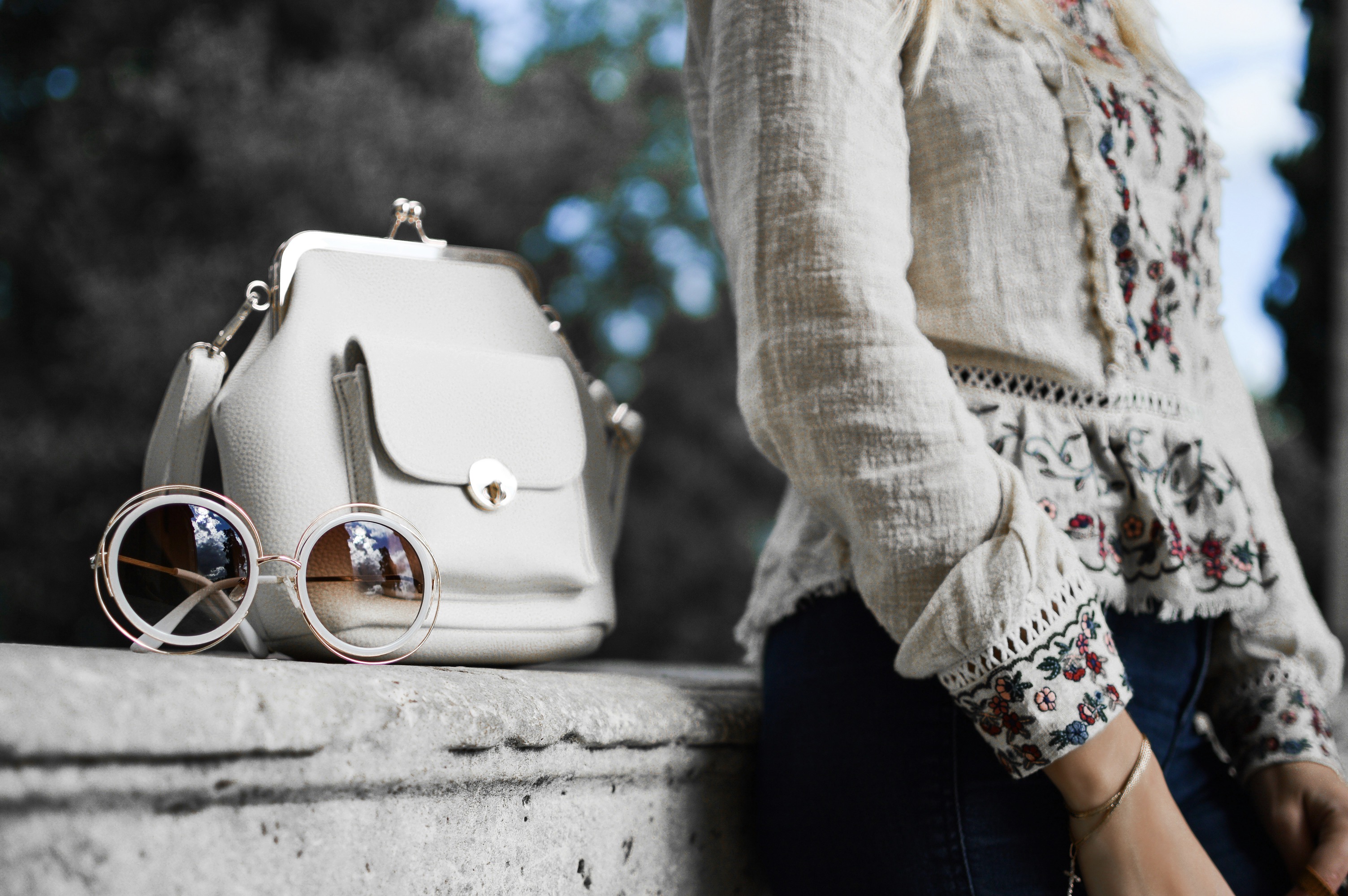
Color coordination also helps with accessories, the final polish on any outfit. Choose a signature metallic or neutral bag that complements your base palette, and then rotate scarves, hats, and jewelry in a couple of accent colors. When you stick to a small number of hues for accessories, you’ll notice how quickly you can assemble outfits without second-guessing. Accessories become anchors rather than afterthoughts, reinforcing overall harmony. Keep in mind that the same color family can appear in various textures—leather, silk, wool—adding depth while preserving unity across looks.
The most reliable way to internalize color coordination is regular practice in real-life contexts. Start by planning your outfits for the week on Sunday, noting which colors you’ll pair with which items. Reassess after each day; if something felt mismatched, ask why and adjust for future combinations. This iterative habit strengthens your instinct for color balance and reduces hesitation. Over weeks and months, you’ll develop a mental catalog of reliable pairings, enabling you to assemble complementary outfits in minutes. Your confidence grows as your familiar palette translates into consistent, polished appearances.
Finally, embrace flexibility within your color system. Life is unpredictable, and wardrobe choices should adapt without sacrificing cohesion. If a garment is temporarily out of your routine palette, find a bridge piece that tethers it to your established hues. A patterned item can pull a whole outfit together by repeating a color from other common pieces. Remember that color coordination is not about rigid rules but about a reliable framework that honors personal taste and body diversity. With mindful practice, your daily outfits will feel effortless, expressive, and consistently coordinated.