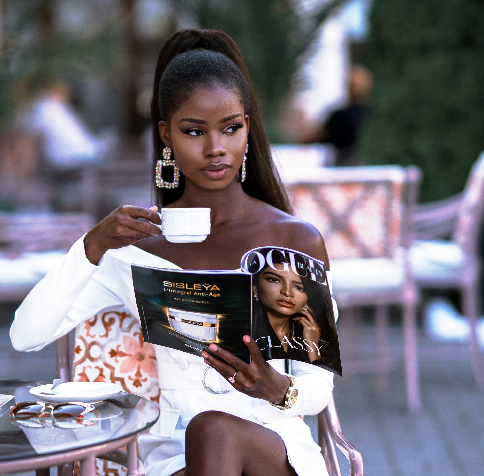
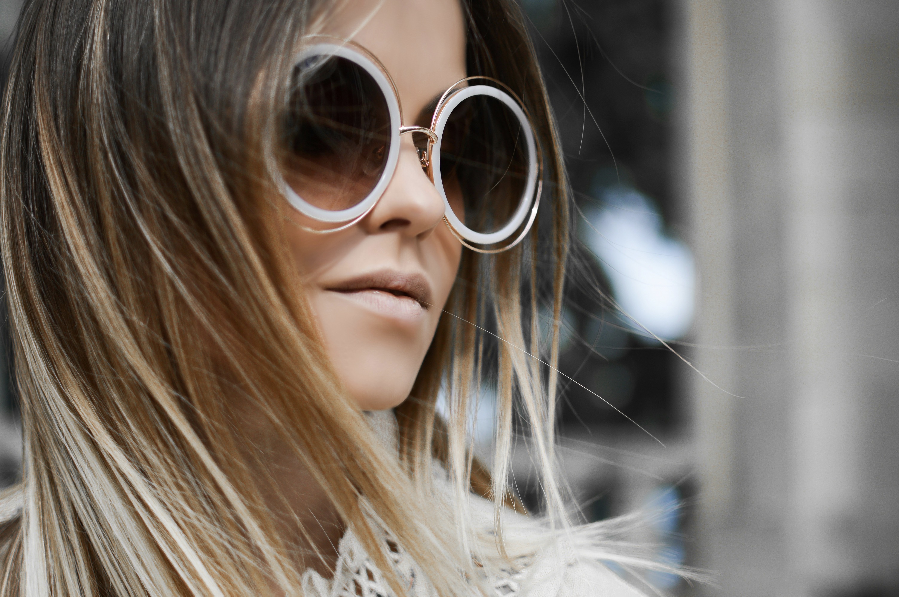
Plus-size
Guide to choosing plus size print placement techniques to draw the eye to favorite features and downplay areas you don’t.
This evergreen guide explores thoughtful print placement for fuller figures, helping you emphasize your best attributes while subtly minimizing areas you’d rather minimize, with practical styling tips and real-world examples.
Published by
Joseph Perry
August 02, 2025 - 3 min Read
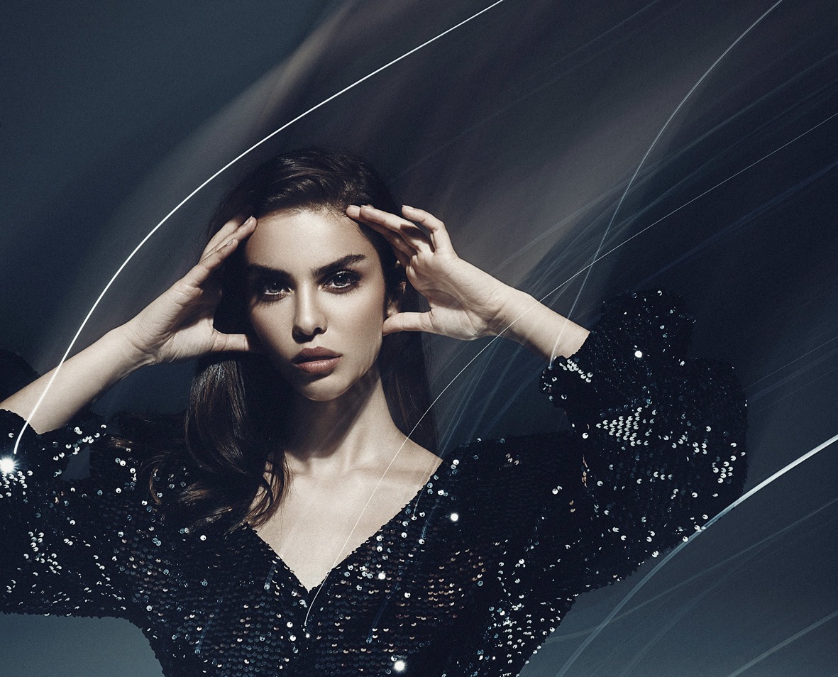
In fashion, print placement is a powerful instrument for shaping perception without changing the body. For plus-size wardrobes, deliberate patterns, scales, and alignments can guide attention toward your strongest features—like shoulders, décolletage, or a narrow waist—while steering the eye away from areas you’d prefer less emphasized. Start by identifying your best asset and imagining a focal line that leads there. Vertical or diagonal patterns can elongate the torso, while smaller repeats near the bust can balance proportions without feeling busy. The key is balance: avoid overwhelming your frame with too many competing visuals, and choose prints that echo rather than clash with your overall silhouette.
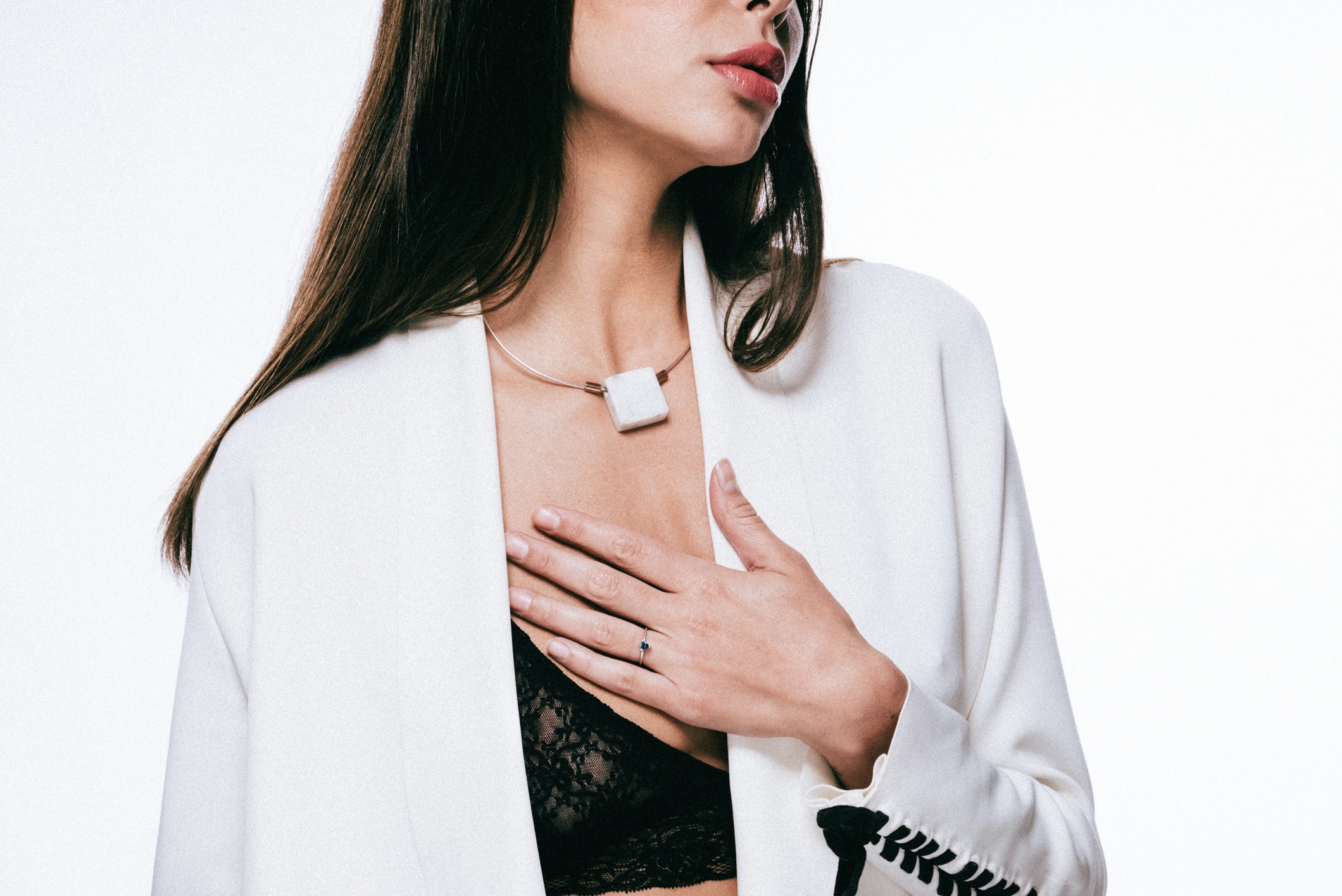
Consider the context of your outfit as you select prints, not just the garment alone. A monochrome base with a strategic print at the hip, for instance, creates a counterpoint that draws attention to your waistline, giving the illusion of a more defined midsection. For the bust and shoulders, opt for prints that either soften edges or introduce gentle verticals, which can slim without looking contrived. When choosing fabrics, matte finishes prevent light reflection that can widen a shape, while slightly textured surfaces add depth without overwhelming the eye. Remember that the print should complement your skin tone and hair color, ensuring the overall look remains cohesive and flattering.
Use vertical lines and proportion to guide the eye toward your best features.
The first principle is scale. Large, bold prints can overpower a petite frame but can work beautifully on fuller figures when positioned thoughtfully. Place larger patterns away from the midsection and nearer the upper body or legs to draw attention where you want it. Conversely, use smaller, repeat motifs on areas you want to streamline, such as the midsection or thighs, to create a smoother visual line. Achieve harmony by mirroring color blocks or repeating a small accent color across the print to maintain continuity. This approach allows you to enjoy dynamic design without creating visual chaos.
Another principle is placement that creates vertical lines. Vertical stripes or motifs oriented along the length of the body can visually stretch height and slim the silhouette. Consider a vertical panel running from shoulder to hip or a carefully positioned print along the center front that nudges the eye upward and downward in a controlled rhythm. When combining prints, keep the larger element at the top and a quieter, narrower motif toward the hem to balance the lower body. This method preserves movement and breathability while delivering a polished, elongated look that flatters plus-size shapes.
Symmetry and thoughtful contrast guide the eye with calm confidence.
Color interaction matters as much as pattern itself. If you want to highlight the bust or shoulders, choose prints with light centers and darker edges near those zones, creating a gentle glow that frames your upper body. For the waist or hips, darker tones or subtler patterns can recede, producing a smoother curve without harsh contrasts. Strategic color blocking, especially when aligned with natural waistlines or seam lines, can create the illusion of a smaller midsection. Avoid clashing palettes that fight for attention; instead, craft a coherent scheme where the focal print anchors the outfit and the surrounding colors support it.
When designing an ensemble, symmetry can help. Balanced prints on both sides of the body yield a calm, intentional appearance, reducing the risk of drawn-out angles that exaggerate. For example, a symmetrical floral motif placed at the chest or a mirrored stripe on each sleeve can create a center that anchors the gaze. If you want to slim the torso visually, offset asymmetry lightly to direct attention away from problem zones without resorting to drastic color shifts. The goal is to feel confident and comfortable, not gimmicky or forced, while still enjoying expressive print artistry.
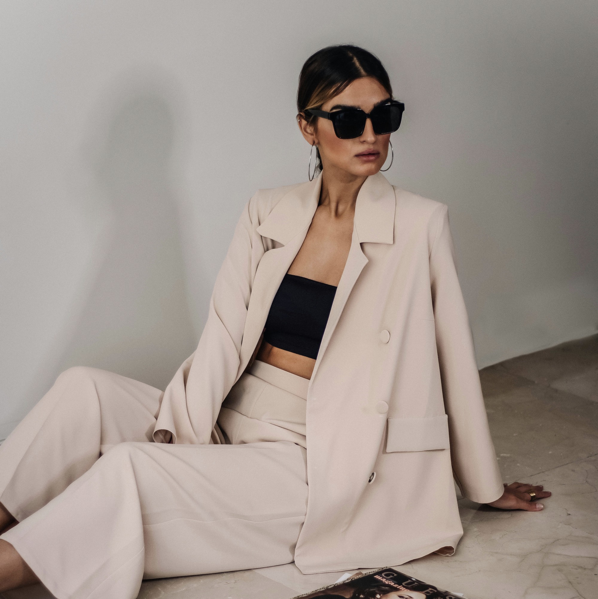
Balance bold prints with solid anchors and thoughtful tailoring.
Texture can substitute for pattern when you prefer a more understated look. A print that incorporates subtle texture or tactile variation can add depth without overpowering your frame. When choosing textured prints, place them where you want the light to fall softly—typically along the bust, shoulders, or sleeves—so they catch the eye in a flattering way. Textural depth can visually slim areas by creating a gentle dimensional shift rather than a flat plane. This approach works well for layering, too, where a textured top peeks from beneath a cardigan, adding interest while maintaining a streamlined silhouette.
Proportion is your quiet ally. The relationship between top, bottom, and accessory sizes shapes the finished line. If you wear a bold print on top, balance the bottom with a calmer, solid piece to prevent overwhelming the frame. Conversely, a printed skirt can be balanced by a simpler solid top. Accessories should echo the print’s central color or a muted shade found in the pattern, reinforcing unity. When possible, tailor the garment so the print aligns with natural lines—shoulder seams, waist seams, and hemlines—to avoid visual distortions that make the body appear wider in certain zones.
Build a cohesive, flattering wardrobe with repeatable print logic.
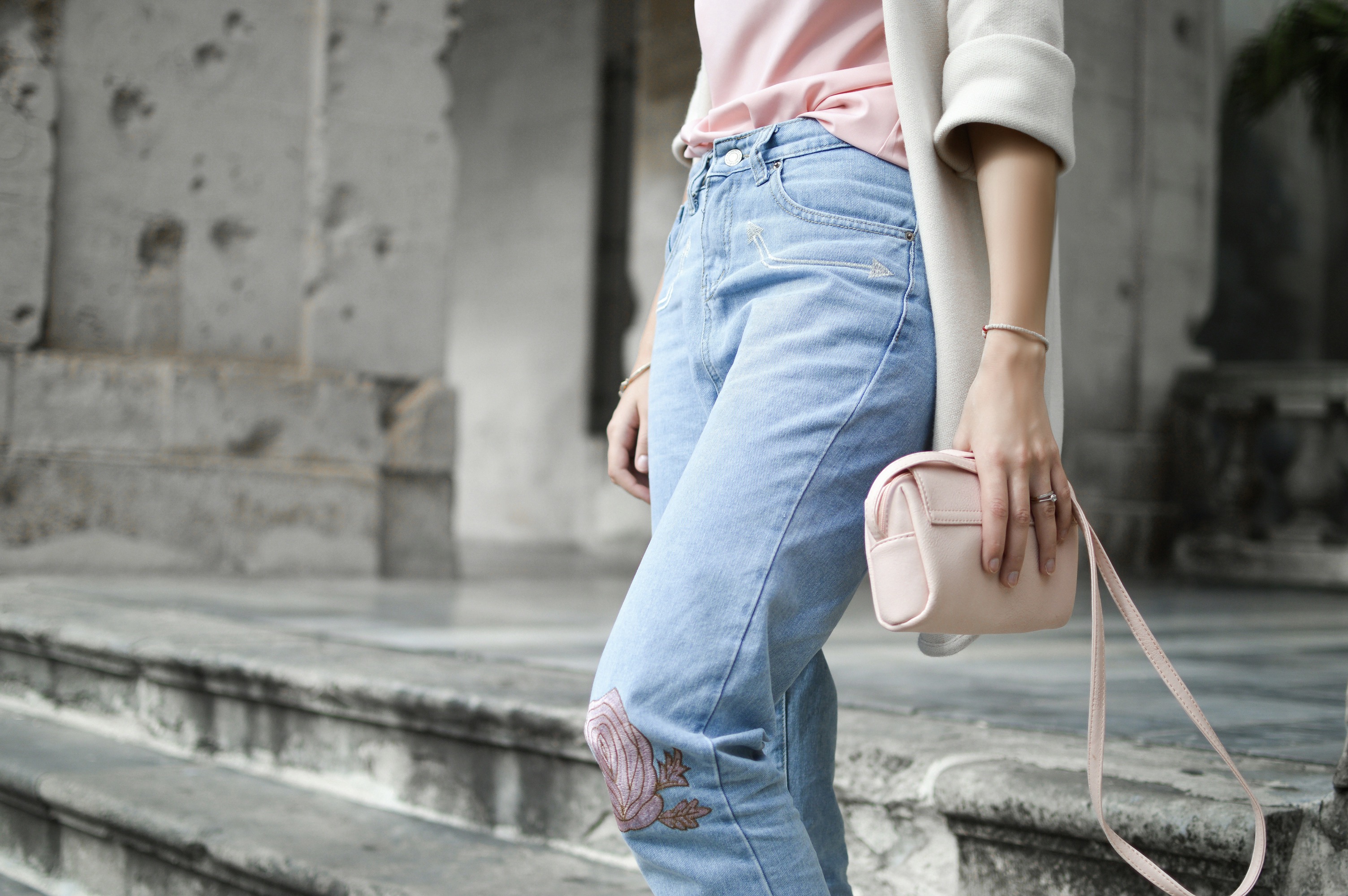
The length and placement of prints influence movement and perception. A hemline that ends at the broadest portion of the thigh can make legs appear shorter, so consider prints that stop above or below that point to create a lengthened silhouette. If you adore a dramatic print near the hip, pair it with a longer, vertical line that descends past the knee, guiding the eye downward in a clean flow. When shopping, test how a print behaves in motion—sitting, walking, and bending—as real-life dynamics reveal how the eye tracks the visual rhythm, which is essential for durable, flattering outfits.
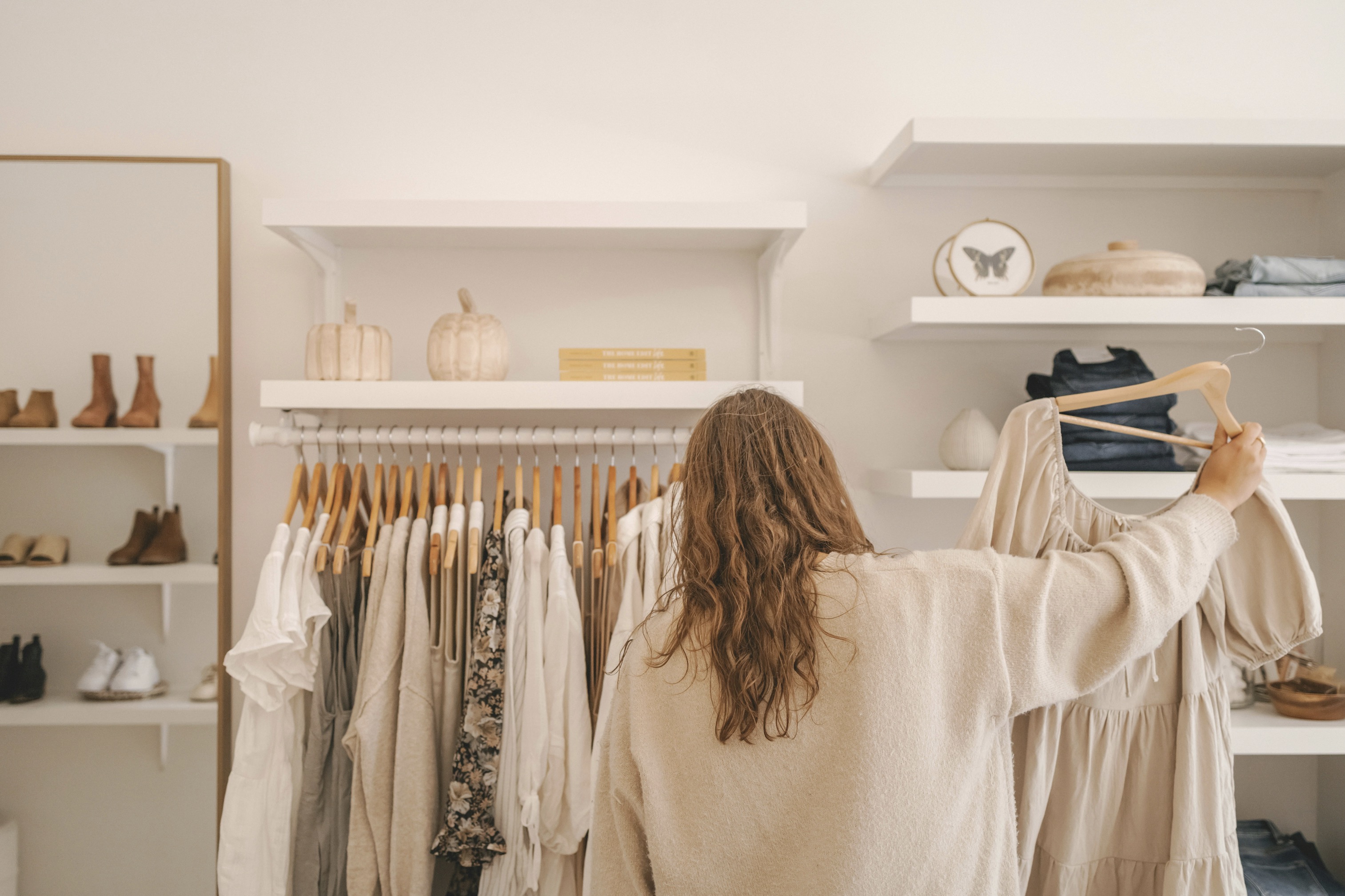
In practical terms, assemble a capsule wardrobe built around a few signature prints. Choose one or two dominant patterns and then mix in compatible solids and smaller accents to maintain variety without chaos. This approach reduces decision fatigue and ensures consistent flattering results across many occasions. For travel or events, pick pieces that deliver both comfort and confidence; a well-placed print can transform a basic outfit into something polished and expressive. Remember to consider undergarments and shapewear, which can influence how prints sit on the body and how smooth the final silhouette feels.
Fit remains foundational. Print placement can amplify a well-fitting garment much more than any embellishment. Ensure seams align with your natural curves, particularly at the bust, waist, and hips. A garment that fits poorly will ripple under prints, creating unflattering distortions regardless of pattern choice. If you’re between sizes, lean toward the size that offers the cleanest outline, then tailor as needed for a custom finish. A well-fitting piece with intentional print placement reduces the need for constant adjustments and maintains a confident, graceful silhouette throughout the day.
Finally, embrace experimentation while staying true to your comfort zone. Try different placements in a controlled way—one new top per season, for example—and observe how friends or mirrors reflect your changes. Your personal style evolves as you learn which prints, scales, and alignments make you feel powerful. Keep notes on what works for your body type, activity, and climate, and build a repository of go-to patterns that consistently flatter you. Evergreen style comes from understanding your lines, choosing prints that enhance them, and wearing them with assurance.