Bridal fashion
How to pick bridal color palettes for small weddings to create intimate, cohesive, and elegant scenes.
Thoughtful color schemes for intimate weddings transform tiny spaces into timeless, cohesive scenes that express personality, mood, and refined taste with clarity and charm.
Published by
Robert Wilson
July 14, 2025 - 3 min Read
Small weddings invite simplicity and intention, but color still shapes mood, perception, and memory. Start by identifying one central color that reflects the couple’s story and complements the venue’s natural light. Use this anchor to guide choices for attire, florals, and décor, ensuring every element echoes the same hue family. Limit the palette to three or four tones at most to prevent visual clutter. Consider the season and venue: soft primavera pastels for garden settings, creamy neutrals for coastal venues, or muted jewel tones for intimate ballroom spaces. Gentle contrasts create depth without overwhelming the eye, preserving an atmosphere of quiet sophistication.
When choosing tones, think in layers rather than isolated colors. Begin with a dominant shade, then add secondary accents that harmonize rather than clash. The goal is cohesion, not perfection. Incorporate light and texture through fabrics, blooms, ribbons, and linens to render the palette tactile and inviting. For small gatherings, you can emphasize warmth by leaning into creams, blushes, or soft taupes while sprinkling a single, deliberate accent color. This approach ensures guests feel enveloped by color rather than dazzled by it, while still allowing personality and style to shine through the design details.
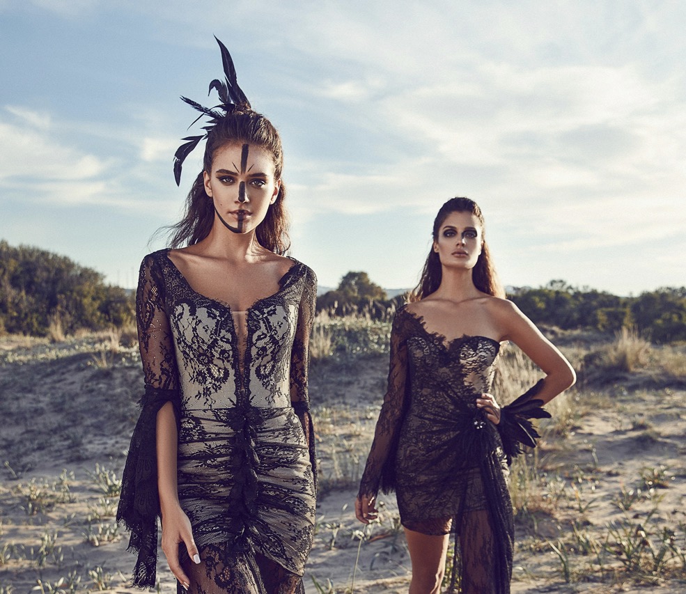
Delicate palettes make intimate moments feel timeless and refined
A well-chosen anchor color grounds the entire wedding story and informs every design choice. In modest venues, anchor tones help the space feel curated rather than cluttered. For example, a warm ivory can underpin gowns, table linens, and arch decor, while a complementary blush introduces gentleness to bouquets and stationery. The key is to maintain proportional relationships among tones so no single element dominates unexpectedly. Avoid extremes that compete for attention; instead, foster a quiet rhythm across floral arrangements, chair covers, napkin bands, and invitations. This rhythm encourages the eye to move smoothly from one feature to another, reinforcing intimacy.
Consider the architectural features of the venue to choose an anchor that harmonizes rather than competes. A sunlit barn responds well to creamy neutrals that brighten photographs and enhance natural textures; a historic church might benefit from soft champagne with taupe uplights that preserve solemnity. If the space has bold textures or colored walls, the anchor color can be slightly lighter or darker to glow in photographs without clashing with surroundings. When in doubt, test swatches beside key elements like the ceremony backdrop or cake stand so you can compare under different lighting conditions and feel the balance in real time.
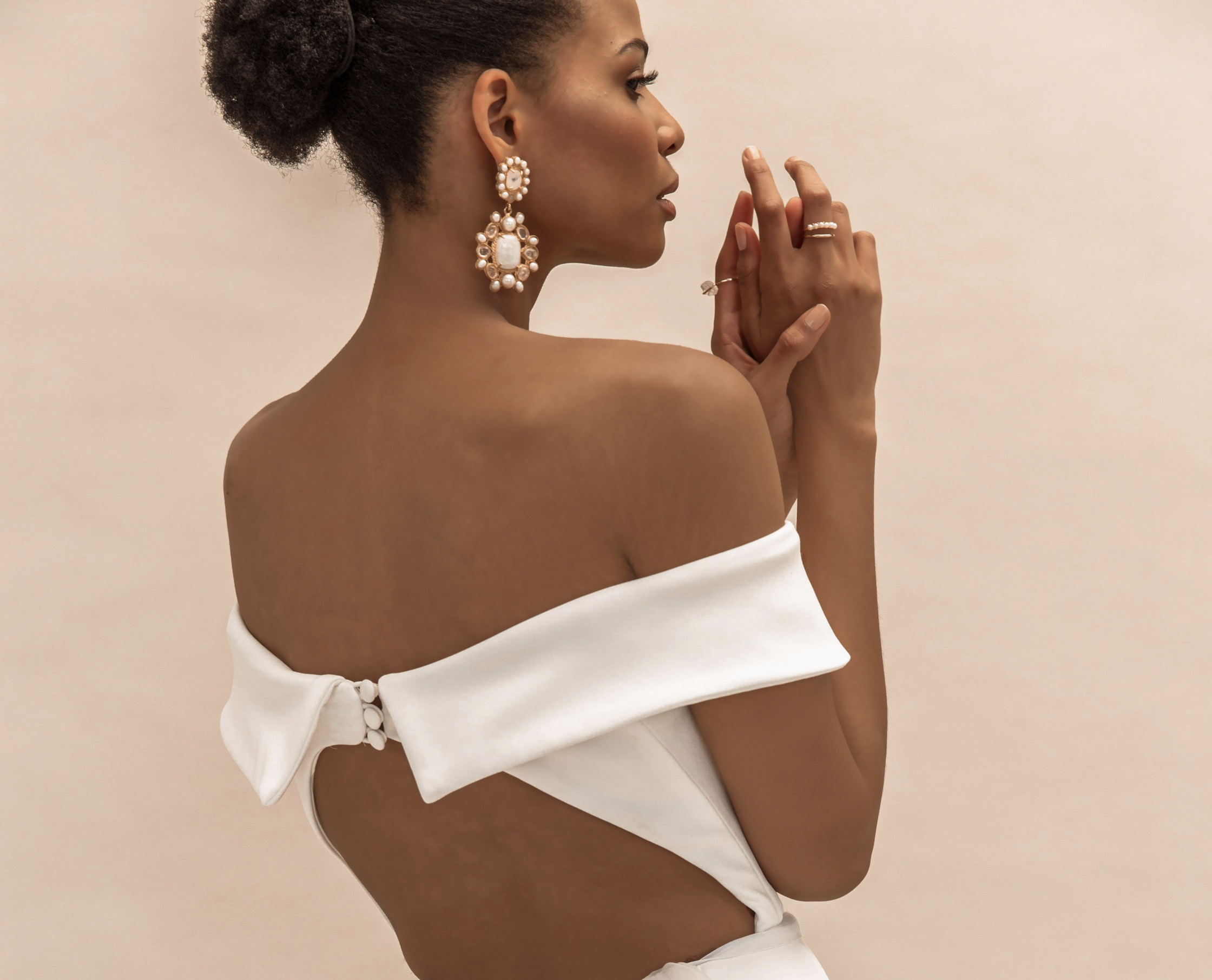
Balance contrasts to keep the scene intimate yet striking
After establishing the anchor, introduce a couple of supporting hues to enrich the scene with nuance. Choose tones that sit on the same cool or warm spectrum as the anchor for harmony. For example, dusted sage can pair beautifully with ivory and pale blush, or a muted lavender can complement taupe and cream. Limit the supporting colors to two; more than that can fragment the mood and complicate photography. Use these hues across bridesmaid dresses, bouquet varieties, ribbon selections, and table settings to create a serene, layered look. The effect should feel effortless, as if the color journey evolved gently from one detail to the next.
Texture and finish influence color perception just as much as pigment. Matte fabrics absorb light and soften color while satin or silk gleams, altering exposure in photographs. For a small ceremony, mix in textures that translate into depth: a matte linen table runner with a satin napkin, or a velvet chair sash paired with sheer organza. Choose florals with color variety that stays within the palette family, ensuring blossoms echo the anchor and companions. Seasonal blooms often provide natural tones that align with the palette’s intent. Finally, test color balance under both daylight and artificial lighting to confirm the palette remains cohesive as guests settle into the evening.
Light, shadow, and context shape how color feels and photographs
Contrast should wake the design without breaking the mood. In small weddings, soft contrasts—like ivory against champagne, or pale pink against clay—accentuate details without shouting. Avoid high-contrast pairings that feel clinical or showy; instead, favor subtle shifts in depth that reveal texture and form. For attire, select dresses in variations of the anchor hue rather than starkly different colors. In decor, combine a dominant color with lighter accents, using metallic touches sparingly to add sparkle without overpowering. Remember that photography loves gentle tonal variation; plan wardrobe and decor so the couple remains the focus amid a softly unified environment.
Practical staging helps showcase color coherence in every frame. Place florals and greenery to frame the ceremony backdrop and focal tables with deliberate color echoes. Use stationery and signage as color anchors in transition spaces, guiding guests through the day with consistent mood. Lighting factors into color perception, so coordinate with a professional to calibrate warm versus cool tones as dusk approaches. Accessories like veils, pocket squares, and shawls can mirror the palette, reinforcing unity. A thoughtfully staged color story translates into more timeless photography and keeps the narrative of the day readable and elegant.
Personalization within restraint creates a lasting, elegant impression
Light plays a starring role in color perception, particularly in intimate venues. Natural light softens, warms, and blends tones, while artificial lighting can shift hues toward yellow or blue. Plan color choices with the expectation of shifting illumination across the event. For morning ceremonies, airy palettes with pale neutrals and touches of blush often read as fresh and delicate. Evening celebrations benefit from deeper neutrals and a single jewel tone for a focal moment—perhaps a bouquet centerpiece or a cake glaze—that anchors the scene without overwhelming it. In all cases, avoid colors that vanish in certain lights or appear muddy in photographs.
To keep scenes unified, build color logic into the sequence of moments. Consider how the ceremony, cocktail hour, dinner, and dancing each echo or evolve the palette. For example, ceremony arrangements might lean toward a lighter shade, while reception florals deepen subtly as conversations unfold. Linens and tableware can introduce a secondary tone during dinner, then give way to accessories that reflect the couple’s personal taste as the night progresses. Consistency across these moments helps guests feel the event is a single, unfolding story rather than a collection of unrelated elements, reinforcing intimacy and elegance.
Personal touches deserve a voice within the color framework. Incorporate hues that reflect the couple’s heritage, favorite memories, or shared travel stories, but render them in controlled doses to preserve cohesion. For example, a beloved blue from a grandmother’s china can appear in a ribbon wrap, cake frosting, and a velvet ribbon on the bouquet. Subtle reminders of personal meaning deepen connection without competing with the primary palette. When guests look back, they should recall a harmonious environment rather than a mosaic of loud statements. The intention behind color choices often translates into a wedding experience that feels intimate, polished, and genuinely reflective of the couple.
Finally, document and revisit the palette during the planning process to maintain clarity. Create a simple mood board that includes fabric swatches, florals, stationery, and small décor items aligned to one palette. Use this visual reference in vendor meetings, budget discussions, and days-before confirmations to prevent drift. A well-managed palette reduces last-minute stress and helps everyone stay aligned with the couple’s vision. By prioritizing cohesion over novelty, small weddings can achieve remarkable elegance. The result is a timeless scene where color supports emotion and memory without sacrificing personality.