Color balance begins with a calm, deliberate palette theory that guides every accessory choice. Start by cataloging the dominant hues in the bouquet and the table decor, then identify accent colors that bridge them without overpowering. Consider the season and venue lighting, which can alter how hues appear in photographs. Materials matter, too: soft satins reflect quietly, while metallics offer subtle gleam. A restrained approach—one or two accent colors with variations in shade—creates harmony across dress, bouquet, and place settings. This method keeps the bride visually anchored while allowing the floral arrangements and tablescapes to breathe, ensuring a cohesive, photographable aesthetic throughout the celebration.
Once you establish a core color framework, test your selections in context. Imagine the bride moving past a cluster of arrangements or pausing at a reception table; the accessories should read as extensions of the scene, not distractions. Use swatches to compare how fabrics, metal tones, and stones interact with bouquet hues and linens. Take note of warmth, depth, and brightness; a warmer skin tone can transform a cool accessory into something unexpectedly flattering. Collaborate with the wedding planner to preview these accents under different lighting scenarios, from candlelight to daylight. This practical preview prevents color clashes and guarantees a polished, harmonious narrative in every image.
Aligning tones across bouquet, dress, and decor yields lasting harmony.
Start with the bouquet as the anchor and orchestrate every accessory around its core hues. If the bouquet features blush pinks and ivory, for example, choose accents in champagne, taupe, or soft gold rather than bold contrasts. This subtlety preserves romance while avoiding competing focal points. Accessories include jewelry, shoes, and a clutch, as well as the belt or sash if the dress design allows. Use reflective metals to echo metallic accents in the tablescape, creating an integrated glow. The key is to maintain a gentle echo across elements so the eye travels naturally from bouquet to dress to table decor, never jolting with abrupt color shifts.
The table decor is a crucial reference for color coherence. Compare napkin bands, runners, centerpiece vessels, and candle accents with the bouquet hues you’ve chosen. If the flowers lean cool—lavenders, soft lilacs, and whites—opt for complementary cool or near-neutral accessories to avoid muddiness. When tables feature warm amber lighting, lean into slightly warmer accessory tones to harmonize ambience and attire. Remember texture alongside color; a satin ribbon might read differently under warm light than a matte one. By aligning texture and shade with the dining environment, you create a connected, editorial-worthy look that translates beautifully in photos.
Texture, light, and hue collaborate to shape the silhouette’s aura.
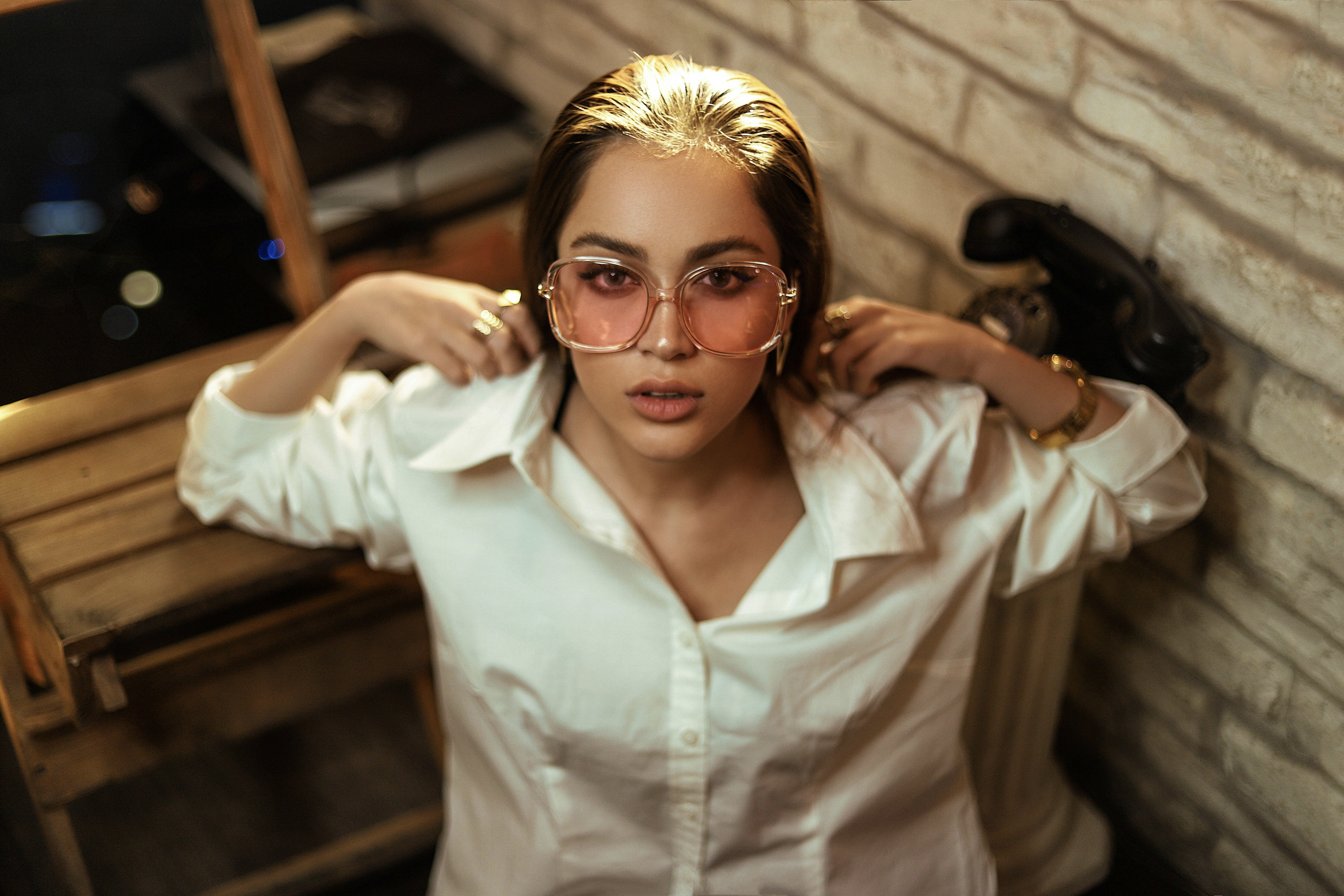
Jewelry presents one of the most expressive avenues for color dialogue without overwhelming the dress. Select gemstones or crystals that pick up micro-shades from the bouquet and linens, rather than introducing new, loud colors. A necklace with pale champagne crystals can wink at both ivory and gold, bridging the bridal gown and the surrounding glow. Earrings can mirror a secondary hue in the bouquet for a cohesive micro-story around the face. Shoes, a belt, or a headpiece become quiet amplifiers of the palette, not competing speakers. Fingers, neck, and hair should all carry a unified thread that ties the entire visual story together.
Nail color and makeup choices complete the accessory color conversation. Choose a neutral base with a whisper of the accent color to keep hands and face harmonious with the rest of the ensemble. If green foliage and sage-toned ribbons appear in the decor, a soft pearl or pale mint manicure can echo those tones without dominating. In makeup, carry the accent through a single shade across lips, cheeks, or eyeliner to unify the look. The goal is a cohesive finish, where every little detail speaks the same color language, making the final portraits read as one well-composed image.
Previews under varied lighting reveal the true harmony of colors.
Accessories should support the wedding’s silhouette while playing with hue in a controlled way. A gown with clean lines welcomes subtle metallic accents in jewelry, shoes, and a clutch, so the light can dance across the surface without breaking the color narrative. If the bouquet is saturated with bold tones, keep embellishments delicate; the contrast will highlight the flowers rather than compete with them. Conversely, a softly colored bouquet benefits from a hint of richer metal tones to create depth in photographs. The aim is to let the color dialogue remain fluid, ensuring every frame captures a balanced, elegant silhouette.
Lighting is a silent co-author of color perception. Warm candlelight softens edges and can make cool-toned accessories appear warmer; cool daylight sharpens contrasts and may reveal undertones not visible indoors. Before the wedding, preview how accessories read in both settings, using a photographer’s test shot to verify balance. If you notice a color drift, adjust the palette by swapping a shade or tweaking saturation rather than overhauling the entire scheme. Small, thoughtful tweaks preserve the intended harmony while adapting gracefully to real-world lighting conditions that shape the final imagery.
A unified color language binds every image into a single story.
Practical shopping steps help translate the vision into tangible details. Begin with a color swatch set that includes the bouquet hues, table linens, and possible accent tones, then compare fabric weight, sheen, and undertone. A small, cohesive set of accessories—earrings, a delicate bracelet, a slim belt, or a hairpiece—creates a consistent look. Avoid mixing too many metallics, which can fracture the color story; if you use gold, keep it uniform across jewelry and accents. For bridesmaids and mother-of-the-bride, ensure their accessories thread the same color family subtly, reinforcing unity without overmatching.
Final checks ensure the color plan remains resilient from ceremony to reception. Review photos with the photographer, focusing on how the bouquet, dress, and table decor appear alongside accessories in different venues or setups. If a particular hue seems to disappear in photos, you may need to tweak saturation or swap to a closer shade that reads better on camera. The goal is a consistent color voice throughout the day—softly echoed across all elements, so the imagery tells a single, seamless story rather than a sequence of unrelated moments.
Beyond aesthetics, consider the narrative your color choices convey. Gentle hues can evoke romance and timelessness, while richer tones may communicate luxury and modernity. The bouquet acts as a living guide, so keep the accent palette narrow and purposeful, allowing the décor and dress to reflect the same mood. This approach helps photographers arrange angles that maximize harmony: a close-up on the bouquet, a table shot, and a candid moment can all share the same chromatic thread. Thoughtful restraint often yields the strongest, most enduring images that couples revisit with delight.
Finally, document the journey of color selection for future events. Create a brief, shareable color brief that captures the palette, textures, and lighting notes used for the wedding. Use it as a reference for future anniversaries or other celebrations to maintain continuity in family photography and storytelling. The evergreen principle is that restraint plus intention produces cohesion, allowing every accessory to contribute to the whole without overpowering it. When the couple revisits their album years later, the colors should feel familiar, balanced, and unmistakably, beautifully theirs.