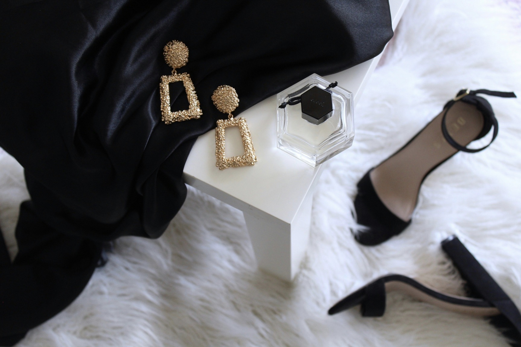
Tattoos & piercings
Creative placement ideas for small tattoos that look intentional and attractively subtle.
Small tattoos can make a powerful statement when placed with intention; this evergreen guide explores discreet yet striking locations, proportions, and design principles that elevate subtle ink into a deliberate personal signature.
August 09, 2025 - 3 min Read
Small tattoos have a distinctive power because they invite close examination rather than shouting for attention. When placement aligns with natural lines of the body, it creates a quiet cohesion between skin and design. Think of arcs along the side of the ribcage that follow breath, or a tiny constellation tucked behind the ear that only reveals itself in certain light. The key is choosing a zone that feels personal, not merely trendy. Subtle ink often benefits from limited color or delicate line work that respects the body's contours. This approach nurtures a sense of intentionality rather than casual decoration, helping the wearer feel connected to the artwork without feeling exposed.
Start by evaluating personal routines—how you move, dress, and what you don’t typically exposure in public. A placement that lazily reads as random can still land as meaningful with a deliberate motif. For example, a minimalist dot in the inner wrist can echo a pulse point, a tiny crescent near the collarbone can mirror the curve of the neck, or a fine line along the foot’s edge can resemble a seam on a favorite shoe. Subtlety also comes from scale; smaller is usually more versatile, easier to disguise for professional settings, and more likely to age gracefully alongside you. The longevity of a small tattoo depends as much on context as on design.
Thoughtful placements tied to daily rhythm and personal secrets.
The behind-the-ear area offers a refined canvas for almost weightless designs. A single dot or a micro-symbol can peek out when hair is styled up or a breeze lifts a strand. This space allows for an almost intimate reveal, which can feel like a private signature shared with the world in rare moments. If you prefer something with meaning, consider a tiny line of punctuation or a tiny feather that aligns with the ear’s natural curve. Because this site is easy to cover, the tattoo maintains its elegance and reduces the chance of visual fatigue. The result is a discreet piece that remains legible with time.
Another timeless option is the inner forearm or inner wrist where lines and symbols read clearly yet stay approachable. A delicate script word, a short quote in a tiny typeface, or a geometric shape can be read as a personal reminder or a memento. The design should avoid heavy shading that could blur with sun exposure or abrasion. Instead, opt for crisp lines and ample white space to preserve clarity. This placement also invites a casual, everyday connection—visible to you, visible to a trusted circle, but rarely dominating the overall image you present.
Minimal geometry and line work that travels gracefully along skin.
The ankle and foot can host a softly drifting motif that accompanies every step without commanding attention. A small wave, star, or floral element tucked along the outside ankle or near the Achilles can be a gentle reminder of resilience or gratitude. Because these zones are often covered by shoes, the ink remains largely private, offering a sense of personal ritual that only reveals itself to those who notice. Choose a design with smooth, clean lines to prevent blurring over time. Lips of color are generally not necessary; monochrome graphite textures hold their character longest and age with a quiet dignity.
For lovers of geometry, the ankle-to-calf corridor provides a subtle canvas for a short, uninterrupted line or a tiny angular motif. When executed with even pressure and consistent line width, the piece ages gracefully and maintains legibility. The trick is keeping the design to a minimal silhouette rather than cluttering the space. This approach makes the tattoo feel purposeful, like a mark carved into the skin rather than a random scribble. With the right artist, the lines become a quiet, architectural detail rather than a statement piece.
Quiet, intimate placements that reward patient, selective visibility.
The collarbone is a classic stage for understated elegance because it catches light naturally when shoulders tilt. A slender, single-needle line that traces the collarbone’s curve can read as a personal map rather than a graphic symbol. This placement adapts to a wide range of tops and necklines, preserving concealment when needed while still allowing a glimpse of artistry. Color is rarely necessary—black or graphite is enough to convey refinement. A micro-rose or a tiny initial discreetly placed on the proximal collarbone achieves a blend of femininity and restraint, proving that subtle tattoos can feel luxurious.
The ribcage holds a reputation for intimate art that is easy to keep private and surprisingly resilient. Small, continuous scripts or elegant symbols along the upper rib can align with the breath, a constant reminder of presence. The key is ensuring the design is narrow and tall rather than wide, so it drifts along the body’s natural lines. This layout can be tucked away beneath clothing yet offers a satisfying reveal for those who do notice. Protective aftercare and realistic expectations about swelling during healing are essential to preserve clarity over time.
Layered subtlety across jewelry-inspired and near-accessory placements.
The back of the neck offers a discreet runway for a single, delicate motif. When hair is up, a tiny emblem or initial can look almost like a charm suspended at the base of the skull. When hair falls forward, the art disappears from view, creating a private moment of connection with the wearer. This placement works particularly well for people who prefer to keep their ink under wraps during professional settings. Choose crisp lines and avoid heavy shading; the shorter the design, the cleaner and more timeless the outcome will be as the skin ages.
A minimalist behind-the-ear design can pair well with jewelry or accessory choices, creating a layered expression of style. A micro-symbol or abstract mark can echo earrings or a necklace, reinforcing a personal theme without overpowering the overall aesthetic. This approach benefits from negative space, which helps the tattoo breathe and keeps it legible through changes in lighting and hair. It’s ideal for those who want a fleeting, almost secret, wink of ink that nonetheless feels deliberate and thoughtfully placed.
The inside of the bicep is a softer stage for a restrained ink moment when you want a private connection that’s still easy to show. A tiny heart, anchor, or compass can serve as a token of personal meaning, readable at close range but quiet from afar. Because skin at this site shifts with muscle contraction, select a design with straightforward geometry and no thick fills that could blur with time. A short, clean motif ages gracefully and becomes a conversation starter only in the right context, reinforcing the sense that the tattoo is a carefully chosen element of your personal narrative.
Finally, consider a tiny shoulder blade or upper back accent that travels along the shoulder line with a gentle arc. The space is generous enough for a slender design that follows your posture, creating a natural motion that gives the ink a sense of life. This placement is particularly forgiving for scaling and alignment, allowing the line to remain precise as you age. Aim for understated contrast and a design that feels like a bookmark in your skin—interesting enough to notice but not so bold that it overwhelms your overall silhouette.